WEBSITE BUILDER / RESEARCH / SAAS
Smart School is a software company headquartered in Tel Aviv, Israel, that specializes in providing innovative technology solutions for students, streamline administrative processes for educators, and improve communication between schools, parents, and students.
Like an innovative solutions they wanted to come up with a easy website builder for the school which can be easily created and maintained by school teachers or stuffs. My Role as a UI/UX designer was to make the experience of building website easier and make it simple for teachers or stuff.
Feed U ltd & Smart School
Education, Design, Website Builder
UI/UX Designer
2 Months
Adobe XD, Wireframing, Adobe Suite,
Research, Prototyping, Visual Design
Once the project commenced, clients provided me with initial concepts on how the platform would function, but the ideas were disorganized. Consequently, I engaged in multiple collaborative sessions with the client to gain a clearer understanding.
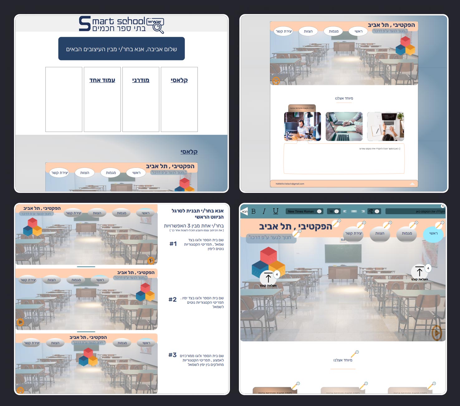
After receiving an initial brief from the clients, including their wireframe, they requested a rapid design variation to confirm alignment. Upon completing the first design iteration, I discussed it with the clients and ascertained that we were on the same page.
Teachers and school staff often lack the technical knowledge how needed to construct and manage a website. Their schedules are already heavily concentrated on teaching and administrative responsibilities, leaving little room to conceive, shape, and refresh a website. Additionally, crafting a website that is intuitive, visually attractive, and able to effectively convey the school’s identity and principles poses a challenge, particularly when design proficiency is absent.
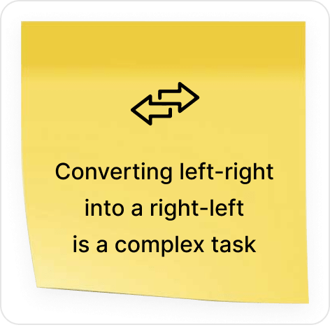
Ensuring the website’s accessibility and functionality across various devices, encompassing smartphones and tablets, necessitates the adoption of responsive web design practices. Lastly, adapting design and content from left-to-right orientation to accommodate native right-to-left languages can prove intricate and demanding.
While the existing competitors like EdTech Solutions, EduConnect Technologies, and TechEdu Systems have provide good Product Offerings, Features, Data Analytics and Technical support. Smart School have to focus on user experience, design, and localization might differentiate it.
However, it needs to consider the strong mobile app offering of EduConnect and the customization emphasis of TechEdu when refining its strategy. Continuous innovation, responsive customer support, and strategic partnerships will be key factors in maintaining a competitive edge.
Initially competitive analysis gives us some insight about the market competitors. What the competitors are doing good in and where we can do better to have some good competitive edge. Besides, that I want to narrow down our users, finding out their needs, pain points, their goals and what makes them comfortable. Also I will try to find out which solutions suits better for users and the business.
After researching I have figured out there can be many users who can use our platform like: Teachers, Educators, Administrative Staff, School Administrators and many more. But for this particular situation we are considering
-Teachers
-Administrative Staff
As our target users for this platform.
Tried to research specifically based of learning curve, website builder usability and right-to-left conversion issue.
– I find out 100 of the 25 teacher/admin stuff(which is 25%) totally find out difficult to use a website builder to build a website.
– Also find out 5 out 1 teacher/admin stuff finds(which is 20%) it difficult to learn a new technology.
– 40% of teachers who were using a word processing software that did not support right-to-left languages had
difficulty using the software.
Tried to find out what type of software our target user daily used.
– Word processing software: This type of software is used to create documents, such as letters, reports, and presentations. Microsoft Word and Google Docs are two popular examples of word processing software.
– Spreadsheet software: This type of software is used to create and manage spreadsheets, which are tables of data. Microsoft Excel and Google Sheets are two popular examples of spreadsheet software.
– Presentation software: This type of software is used to create and deliver presentations. Microsoft PowerPoint and Google Slides are two popular examples of presentation software.
– Database software: This type of software is used to store and manage large amounts of data. Microsoft Access and MySQL are two popular examples of database software.
– Graphic design software: This type of software is used to create graphics, such as logos, flyers, and posters. Adobe Photoshop and Canva are two popular examples of graphic design software.
Most common issues our target user face using website builder
– Technical Complexity: Many users may lack technical skills or familiarity with website builder interfaces, leading to difficulties in understanding how to use the platform efficiently.
– Design Challenges: Designing a visually appealing website with cohesive branding and aesthetics can be challenging for users who are not well-versed in design principles.
– Mobile Responsiveness: Ensuring the website displays properly and functions well on various devices, such as smartphones and tablets, can be a struggle for users without responsive design knowledge.
– User Experience: Ensuring an intuitive and user-friendly experience for all users, including students, parents, and colleagues, may be difficult without a strong understanding of user experience design.
– Learning Curve: Learning to navigate and use the features of a new website builder can be a significant learning curve for users, particularly those who are not technologically inclined.
– Time Constraints: Teachers already have demanding schedules, and dedicating time to learn and manage a website alongside their daily responsibilities can be challenging.
INSIGHTS #1
Designing a visually appealing website with cohesive branding and aesthetics can be challenging for teachers who are not well-versed in design principles.
INSIGHTS #2
In languages that are written right-to-left (such as Arabic, Hebrew, or Persian), user might struggle to ensure that the website’s design, layout, and text direction are correctly adapted.
INSIGHTS #3
Generic website builders may not provide the level of customization required to meet the specific needs of the school, limiting teachers’ ability to tailor the website to their unique requirements.
INSIGHTS #4
Teachers’ primary role is to educate students, which can be time-intensive. Allocating time for website development alongside teaching can be overwhelming.
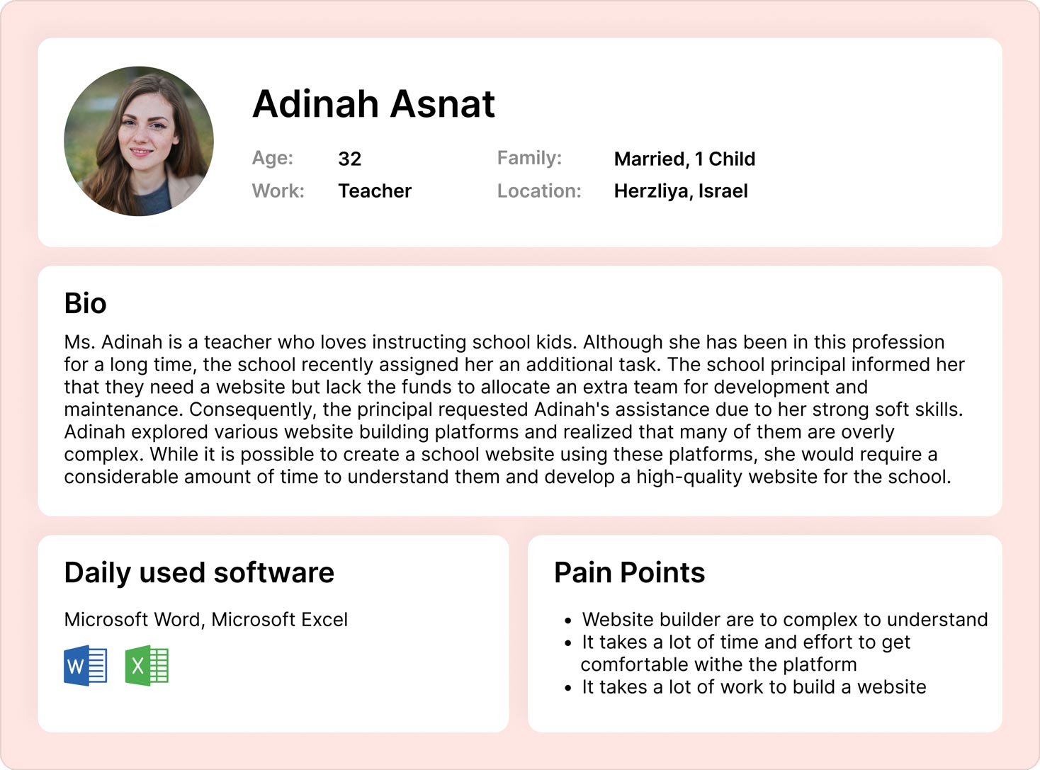
I have built a user persona based on the Information i have gathered.
After completing some research, I got to start with the second design iteration as the timeline for this project was very short. And I have to complete the design, cross checkout with product owner and then submitting to the client for review. So I have completed the second design iteration and Started gathering feedback.
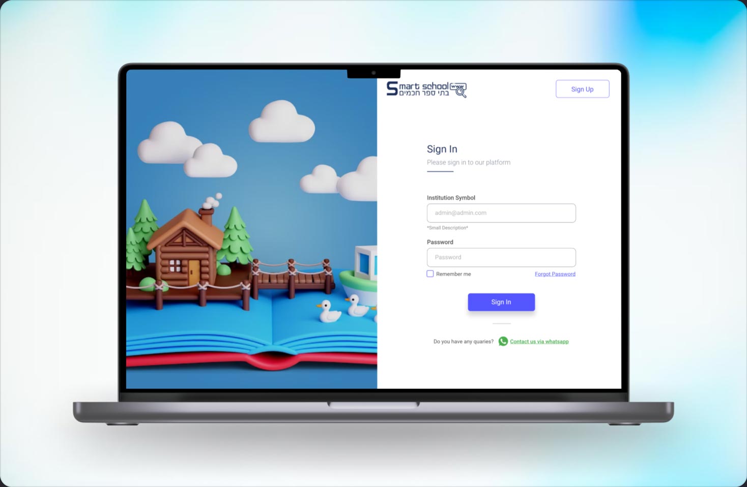
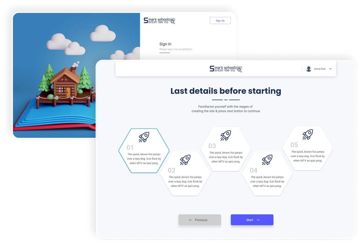
Users primarily sign in to the platform since the sign-up process involves manual completion. The sign-up procedure includes payment-related activities, which the client manages differently. Therefore, onboarding occurs through the sign-in process, along with viewing steps to create website.
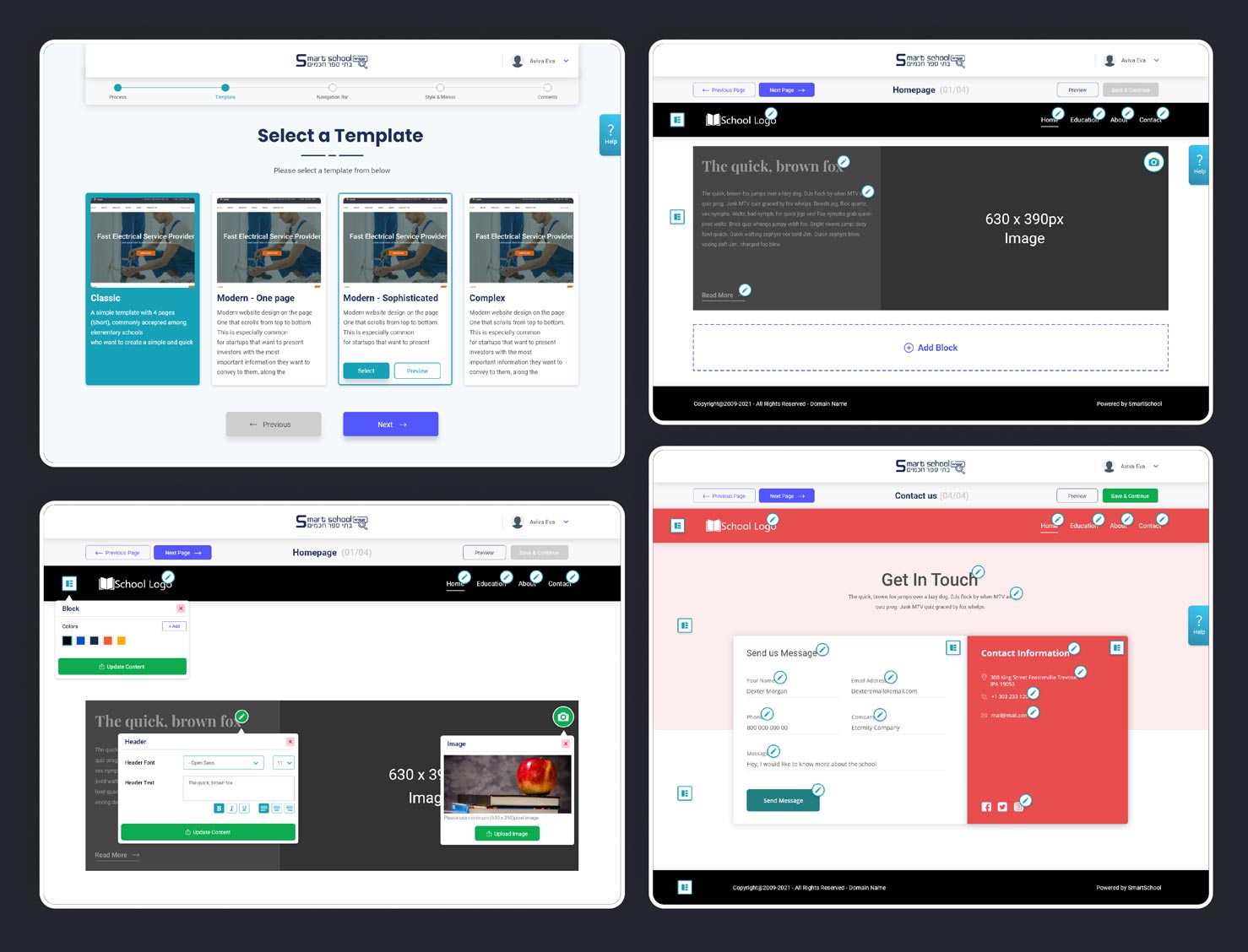
After a basic guidance, we will provide user options where user can choose how they want to build the website. They can proceed with templates or they can start building from scratch. If the choose they want to proceed with templates, they will get the options to select & Preview from templates and choose header style of their website.
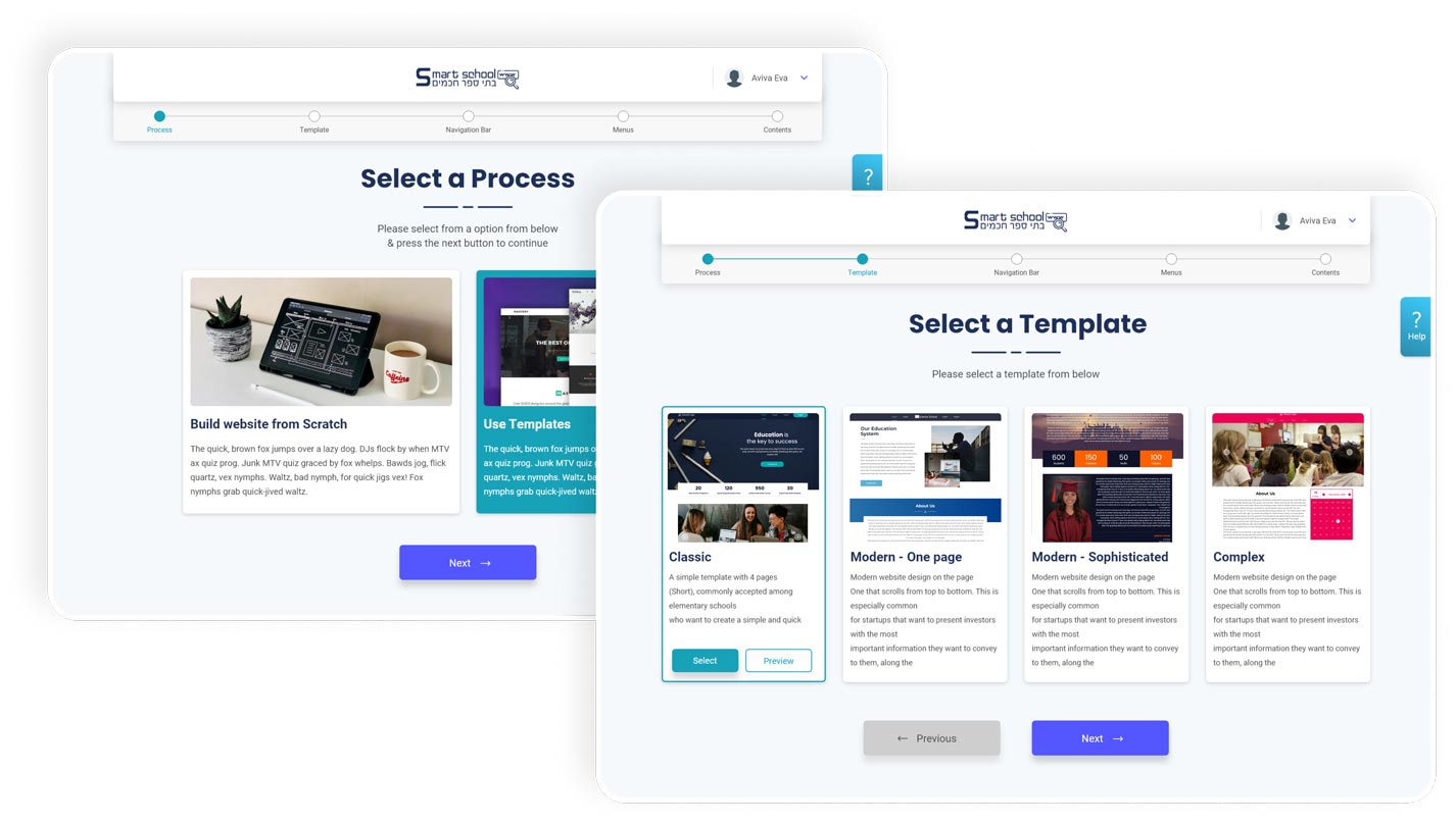
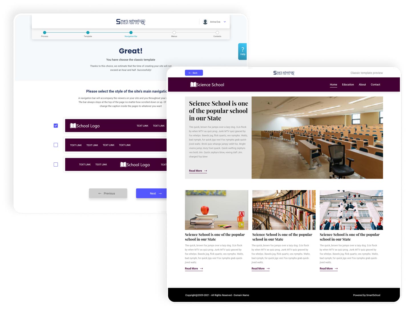
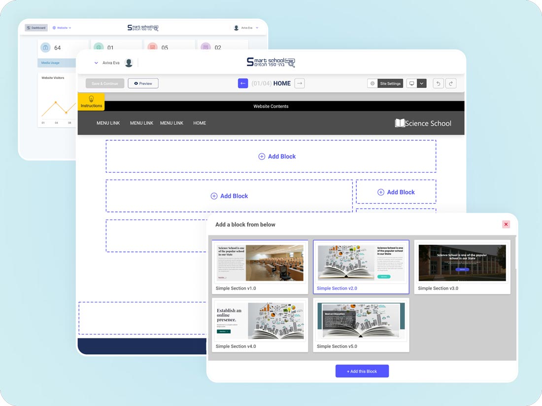
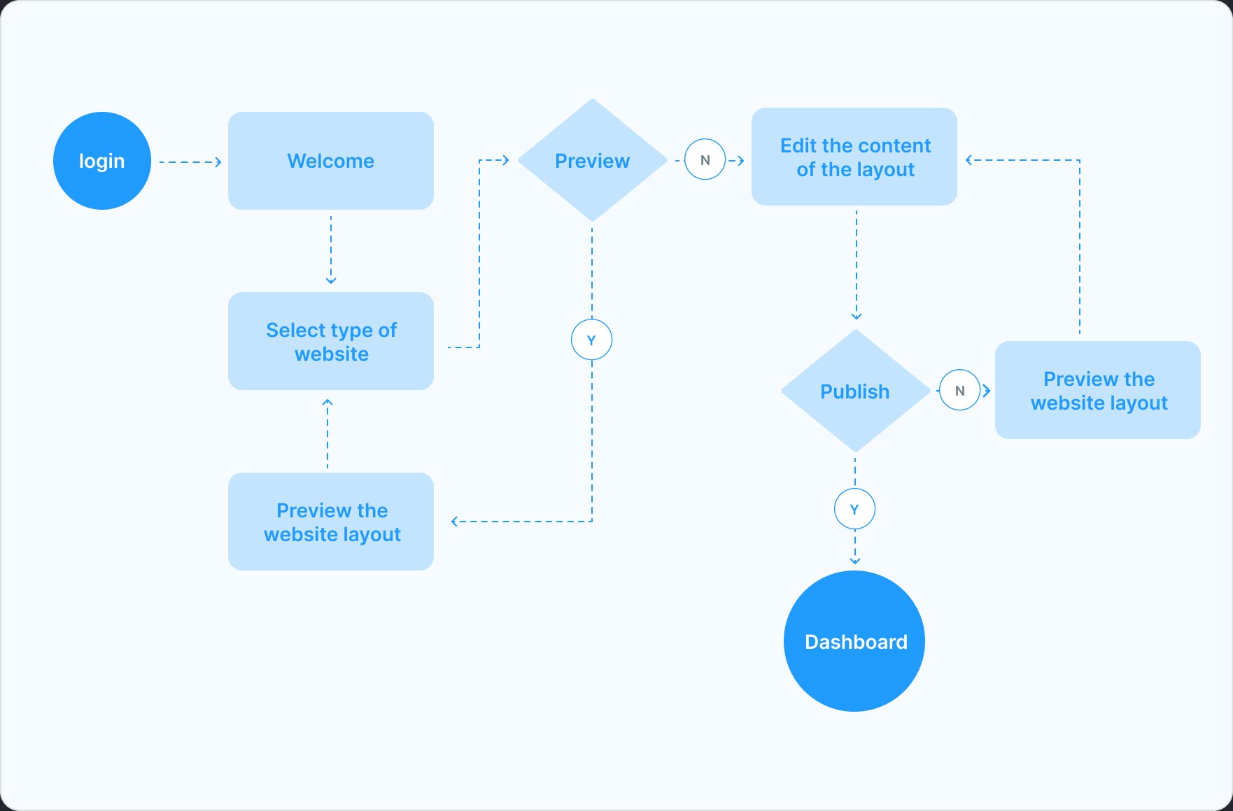
After selecting build website with templates user will only need to edit the content and images for their school and after that they can publish it. Their school website will be ready to share. Beside if they choose build from scratch they will just need to select templates block in the editor and edit the content and publish it!
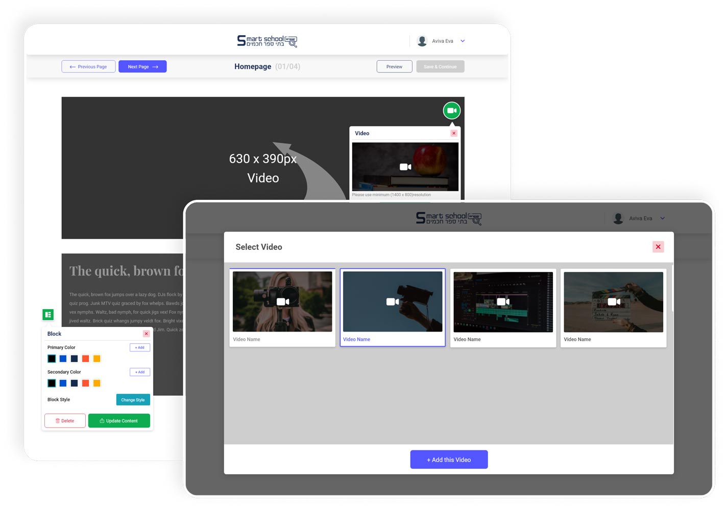
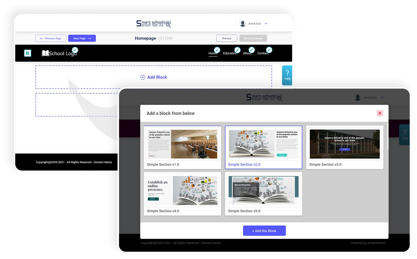
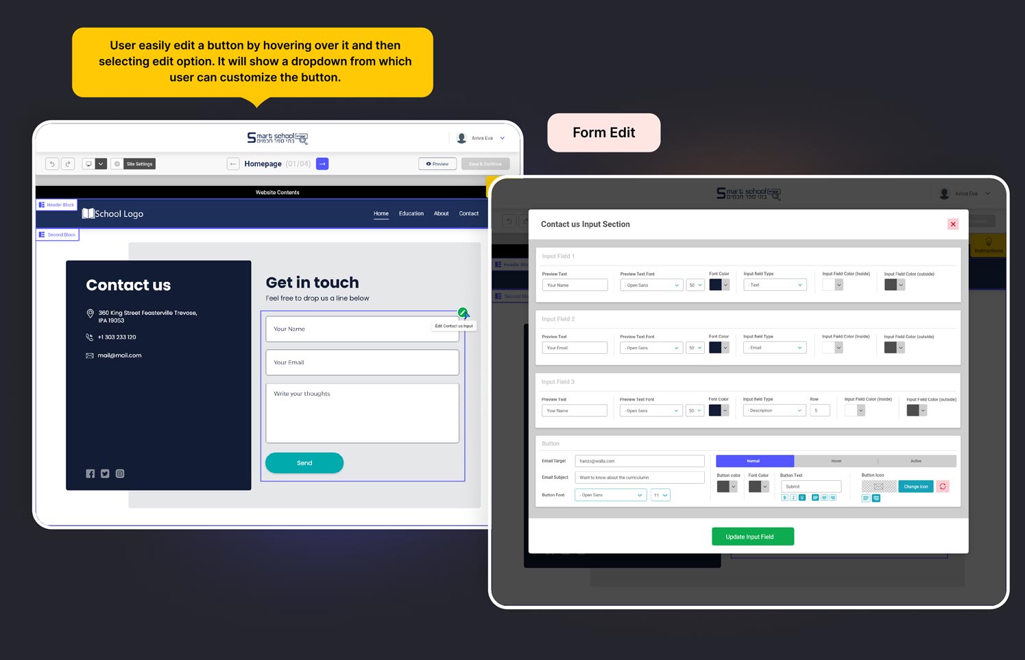
After completing the second design iteration, I got a lot of feedback about the components as in the website builder we don’t only edit one or two things. We do have to handle a lots of editable content and for every one of them we have to provide edit function module and supportable theme so it works consistently. So in rest of the visual design will consist of many edit function component and sample of theme which used for the builder.
There are numerous components utilized within the system, making it challenging to display each one along with its complete flow. Therefore, I will attempt to showcase a selection of components with some associated flow. During the development of these components, multiple iterations were necessary to align them effectively with the system.
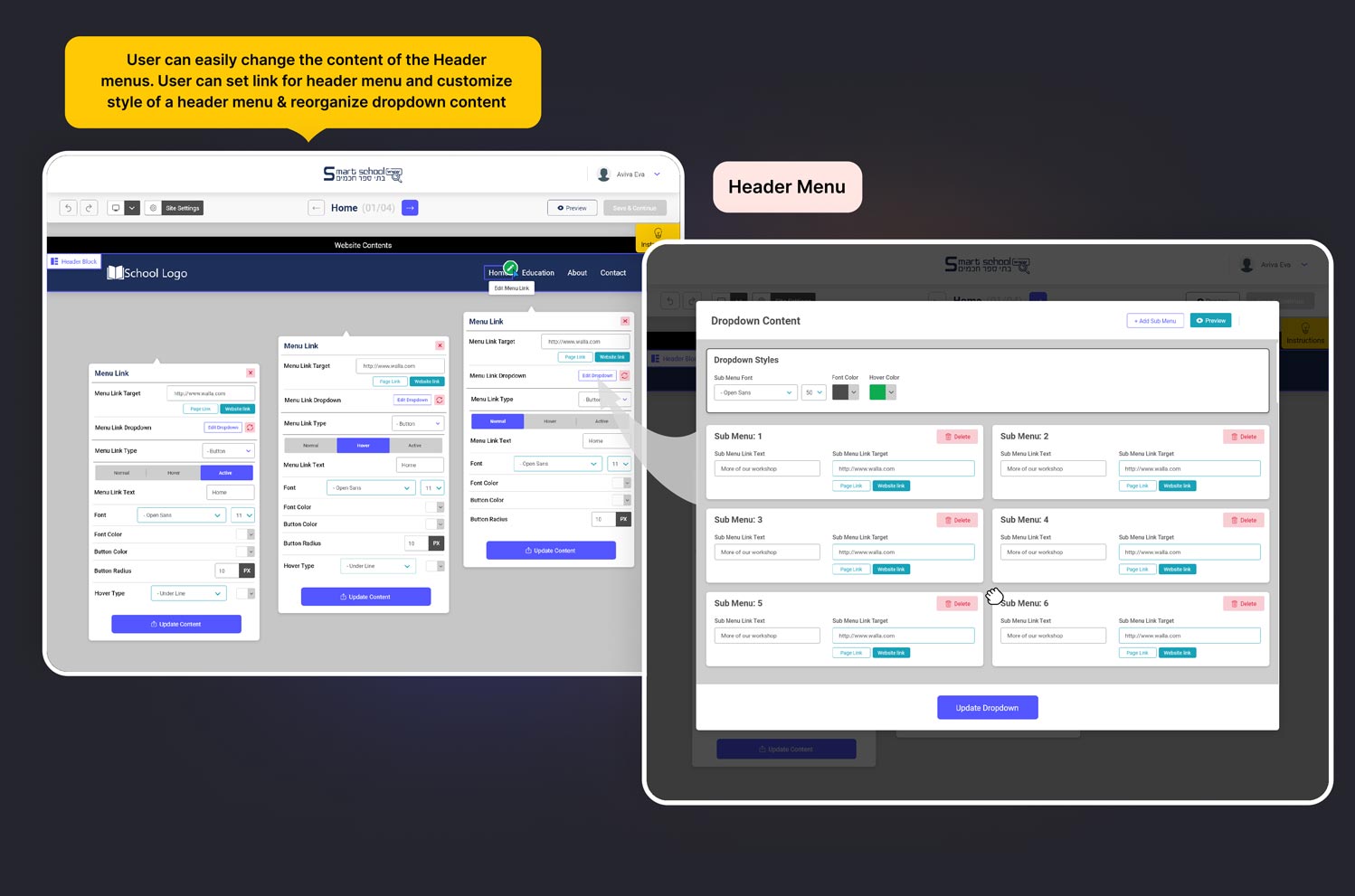
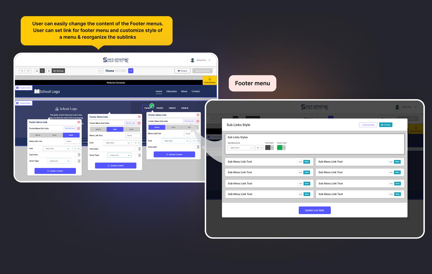
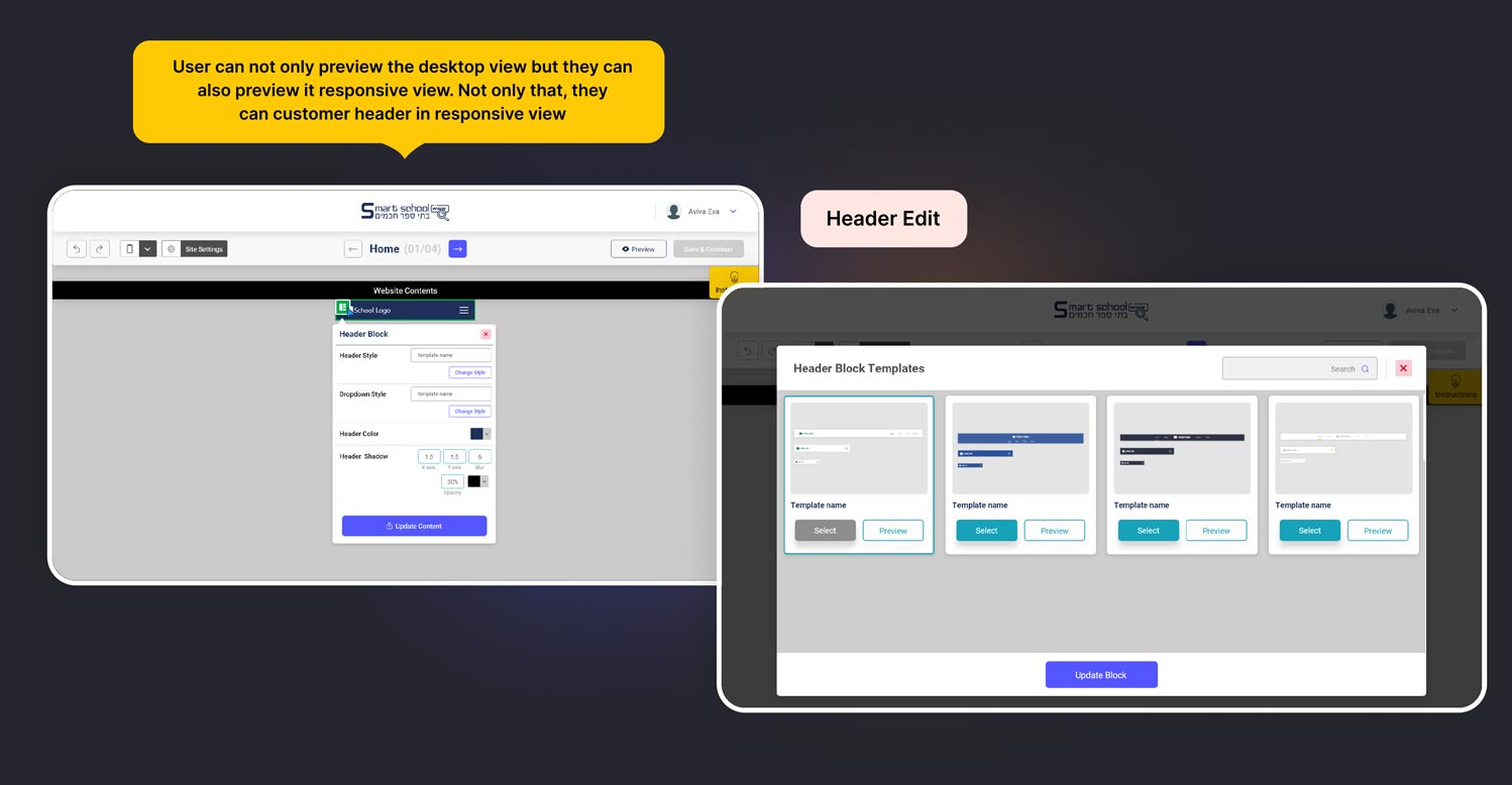
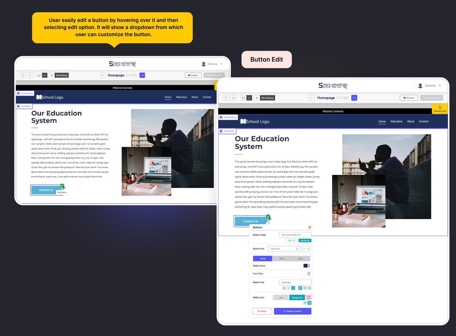
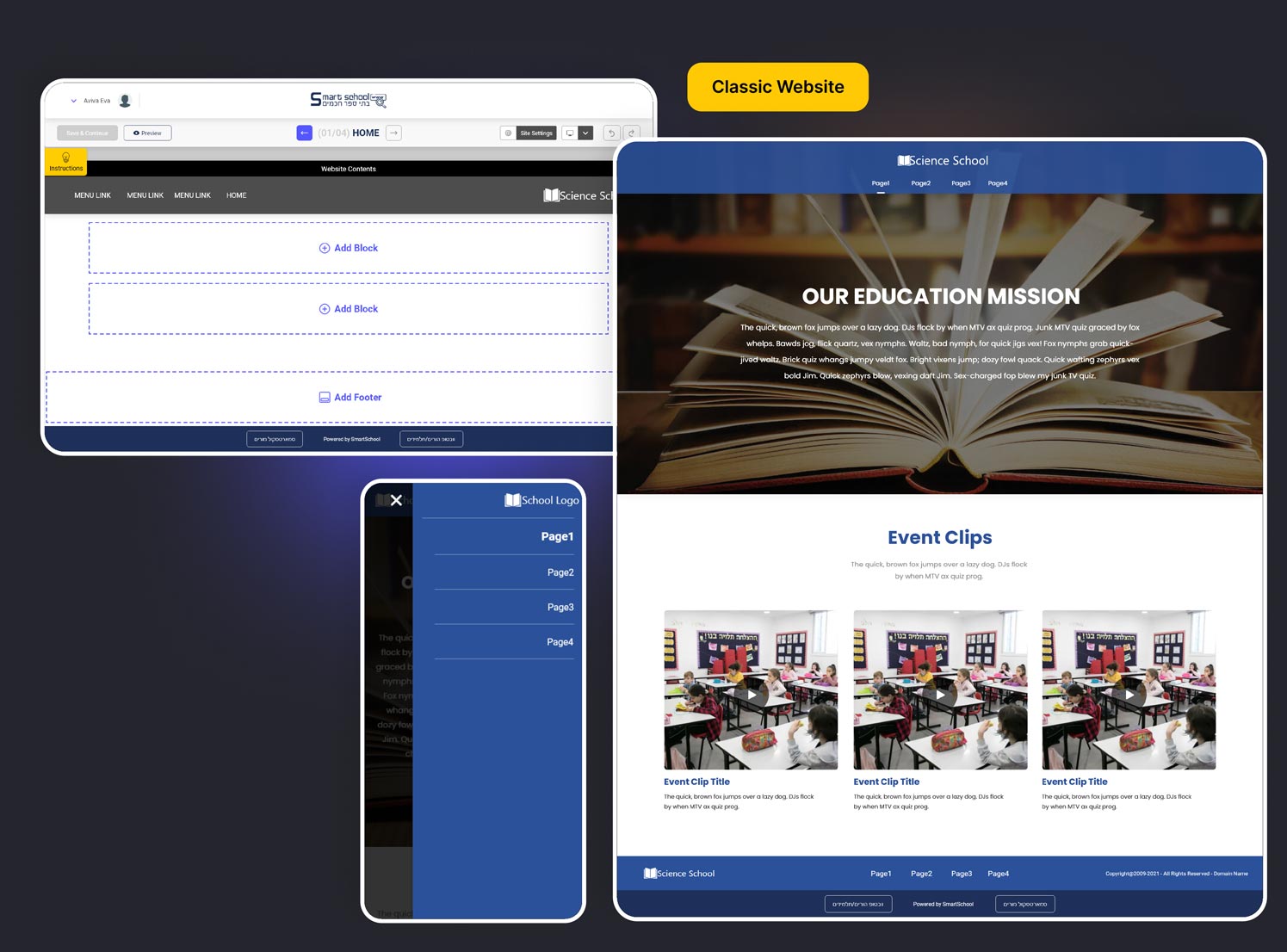
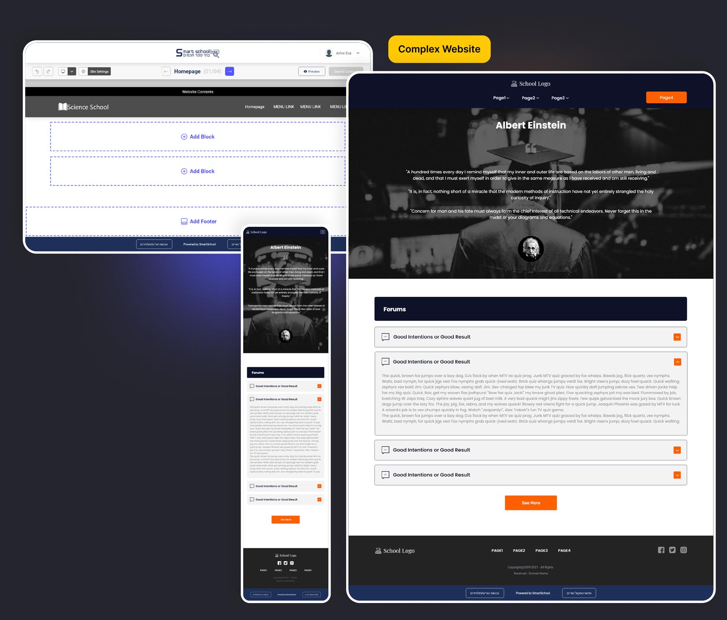
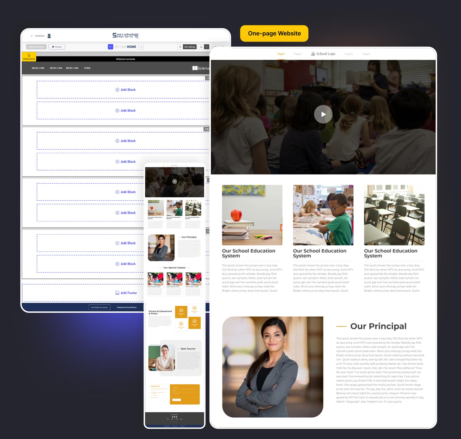
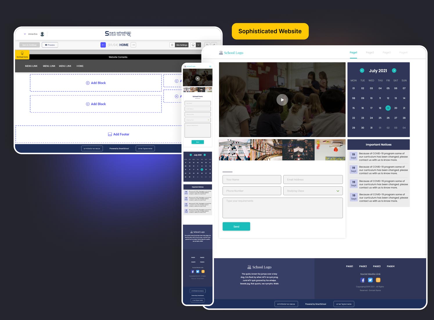
With various components and blocks available, users have a wide array of options to embellish their website. However, the product owner intends to categorize users based on their chosen themes. The complexity of the theme correlates with the cost and functionality; hence, the platform’s themes are divided into four segments: Classic, Complex, One-page, and Sophisticated websites. Below, a glimpse of each category will be presented.
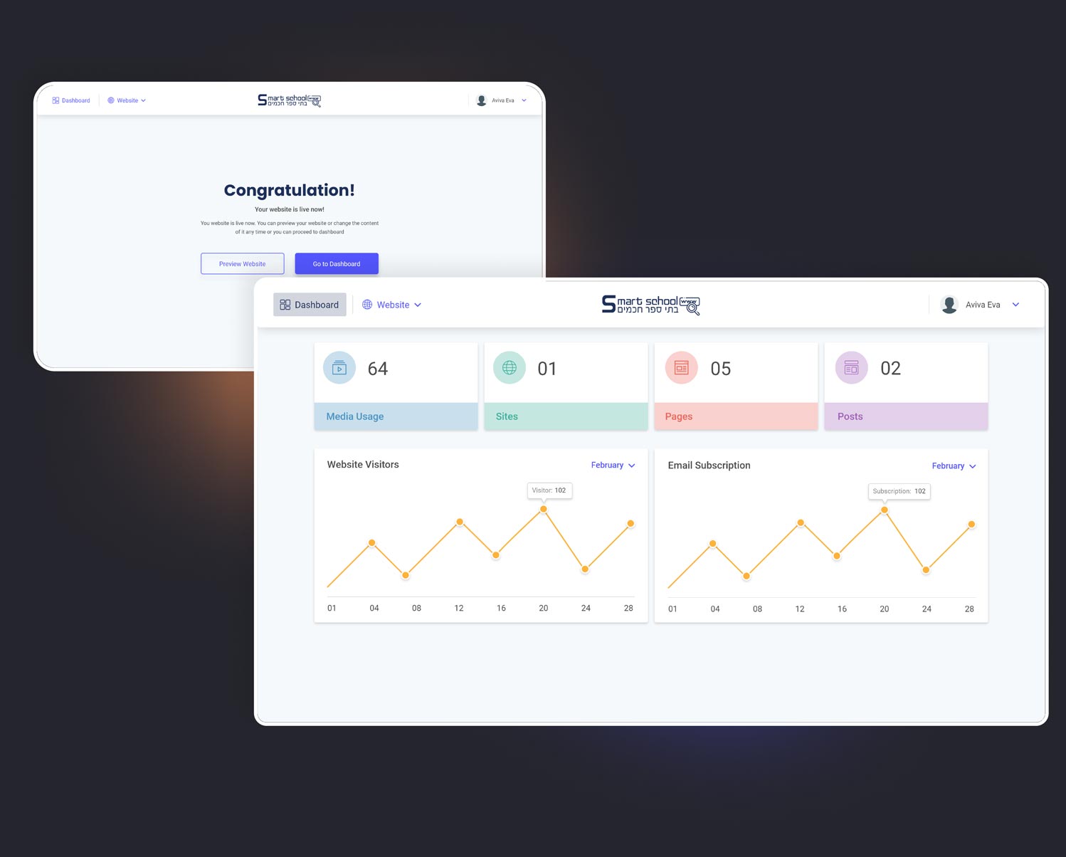
Once users have finished configuring their school website, they can assess its performance alongside other analytics on their dashboard. This serves as their primary website maintenance page, ensuring all necessary information is conveniently accessible in one place.
CHALLENGE #1
Designing within the domain of a website builder is extensive, and maintaining equilibrium across the overall design while resolving intricate issues posed a significant challenge.
CHALLENGE #2
Ensuring a consistent design language and user experience across various features and sections of the builder is challenging, especially as the builder expands in functionality.
CHALLENGE #3
Establishing a clear and logical navigation structure while offering diverse features and tools is complex, particularly in a tool with multifaceted capabilities.
CHALLENGE #4
Designing an interface that visually communicates complex concepts, such as website structure and layout, without overwhelming users with information.
Upon presenting the platform’s design to both the product owner and selected users, we obtained valuable feedback. A significant discovery was that 29.5% of users found the website builder notably more user-friendly compared to alternative platforms. Furthermore, the RTL functionality of the platform garnered considerable user satisfaction.
Upon concluding the project, I experienced a profound sense of satisfaction and gained substantial insights while working in this expansive domain. At the outset, pinpointing the right direction to embark upon was quite challenging. However, through gradual progression and numerous iterations, we successfully reached an outcome that garnered contentment from all stakeholders, ranging from the product owner to the end customers. While there remain ample prospects for enhancement, I intend to take these opportunities into account moving forward.
