MOBILE APP DESIGN / MULTIVENDOR / UX
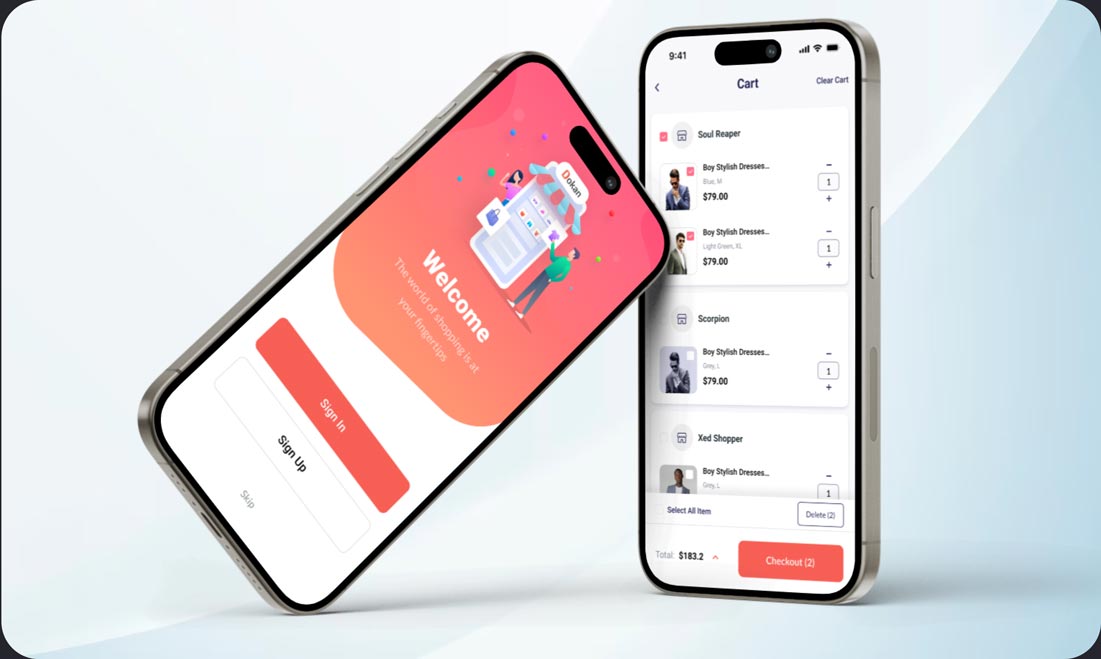
The Cart and Checkout process plays a crucial role in an eCommerce mobile application, as users often abandon their carts or cancel purchases during this stage. If users encounter challenges in completing their purchases or lack trust in the provided data, they may feel insecure and decide not to proceed with the transaction.
In the previous version of the cart and checkout page, there were instances of redundant information, issues with the checkout flows, and some essential information was missing. Consequently, my objective is to create a seamless experience for the Dokan Mobile app’s cart and checkout page, ensuring that users can effortlessly finalize their purchases without experiencing any confusion.
Dokan, weDevs
E-commerce, Mobile App, Design, Multi vendor
Product Designer
2 weeks
Research, Wireframing, Ideation, UI Design, Figma.
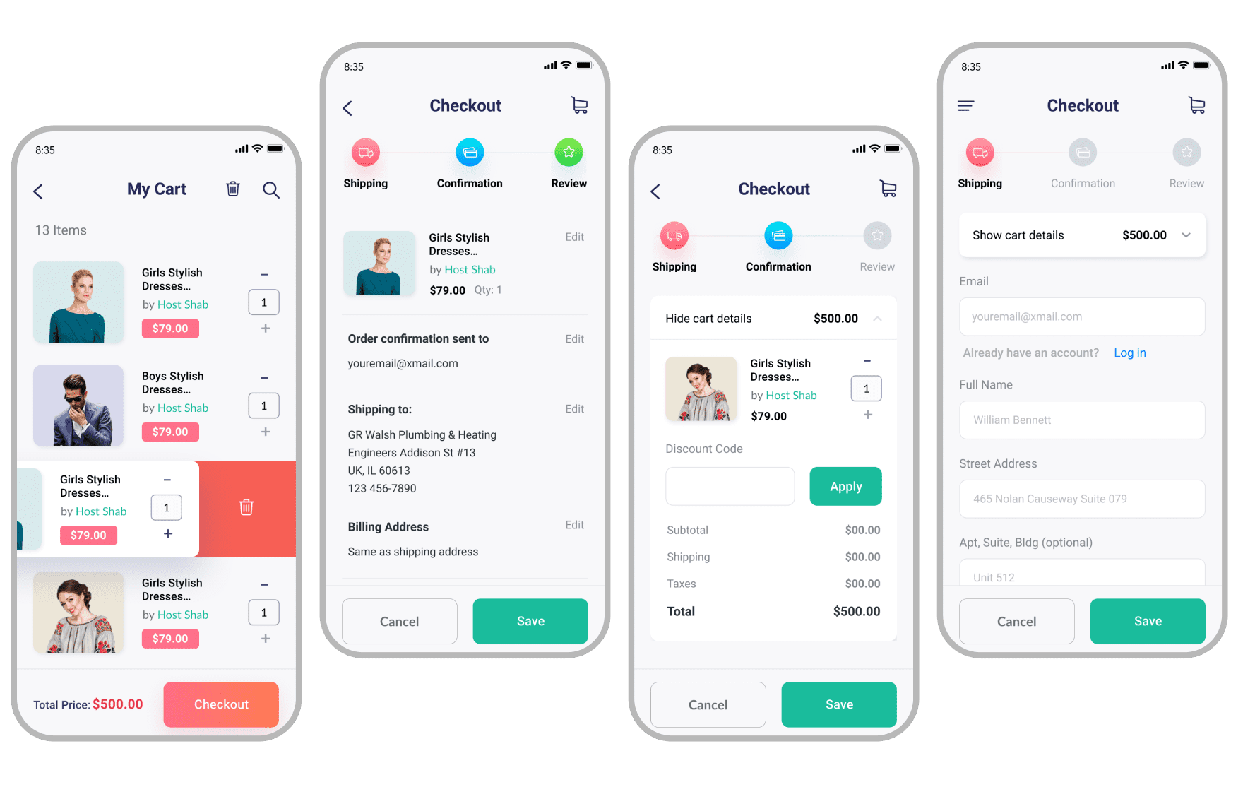
The initial mobile checkout incorporated commendable practices; however, my objective was to enhance its effectiveness within a multivendor system and boost conversion rates on both the cart and checkout pages. Here is the representation of the previous design for reference.
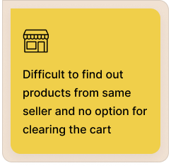
There are notable distinctions between a multivendor ecommerce platform and a single vendor ecommerce platform, particularly in their mobile application checkout functionalities. Although the checkout flows in both platforms share similarities, their operations exhibit significant differences. Implementing a single vendor platform experience in a multivendor platform can result in substantial usability issues.
In an effort to enhance our current multivendor mobile app, I’ve been investigating the issues users encounter. My goal is to precisely identify these issues and generate ideas on how to effectively address and resolve them.
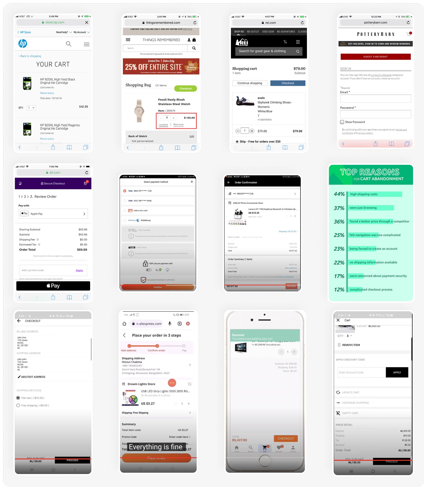
In order to understand the optimal practices for the cart and checkout process in a multivendor mobile app, I conducted a comprehensive competitive analysis. I compiled insights from online survey results, focusing on best practices and user responses.
Additionally, I collected data on how competitors organized and structured their cart and checkout pages.
After researching several competitors like Daraz, Lazada, AliExpress I have find out several user centric approach which is working great for them. So, I have gathered them out for our application. Besides, that multivendor platform cart page is different from the single vendor platform cart page.
I’ve not only looked into the strategies employed by competitors but also explored the optimal practices for mobile ecommerce checkout. This exploration is crucial as I aim to identify practices that resonate well with end users, ultimately enhancing the checkout conversion rate.
INSIGHTS #1
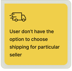
In checkout users need to get individual shipping options for individual sellers as every different sellers will have their own delivery time and method.
INSIGHTS #2
Cart needs to have product categories based on sellers as users might go with vendor wise product to checkout.
INSIGHTS #3
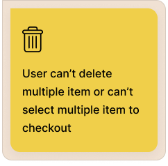
Users might want to checkout selected product from the cart and keep rest of the product for future purchase as next time they won’t need to add in cart, just proceed with the selected item of cart.
INSIGHTS #4
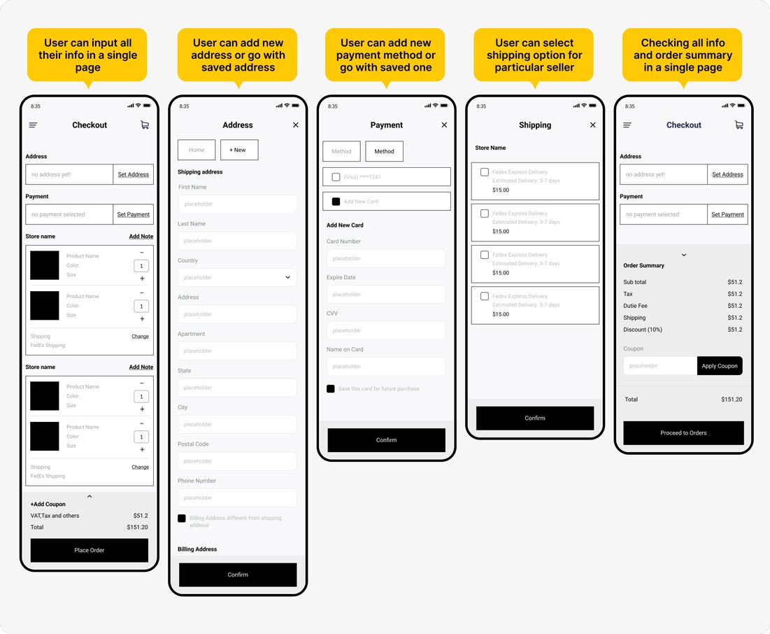
It’s time consuming for a user to travel different page in checkout and change any required information for checkout so if all the information kept in a single page with a flow, it will be easy for them to preview and checkout.
In this project, I utilized Figma to craft the wireframe, leveraging my extensive experience with the application. This choice allowed me to focus more on the output and less on tool-related concerns, given my familiarity with Figma over an extended period.
I have utilized the research data and insights to craft the wireframe for the initial checkout flow, making the ideation more visibly apparent to everyone for the purpose of collecting feedback.
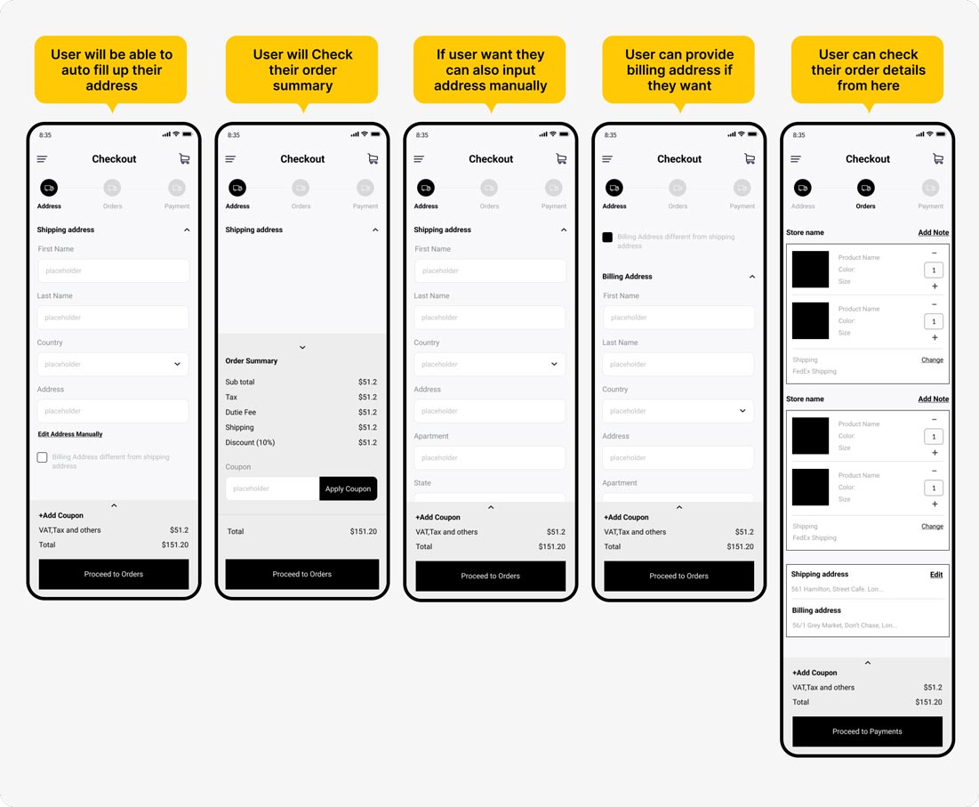
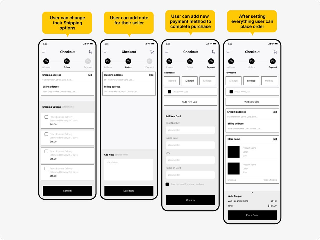
Upon finishing the initial wireframe flow, I collected feedback from the development, analyst, and marketing teams. Following their input, I proceeded to create the subsequent set of wireframes.
After confirming wireframe, it’s time for me to bring the idea into visual design. So keeping the design consistent with the previous design as rest of the application looks like the previous design. After completing first design iteration many feedback arrives like payment can’t be done from the mobile, making shipping and note changes more hand coverage space not in a new page.
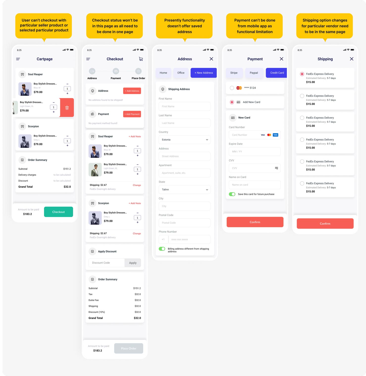
After gathering feedback from the first design iteration, I have resolved and presented them in the second design iteration. But some adjustment has been done in the final design because of release scope.
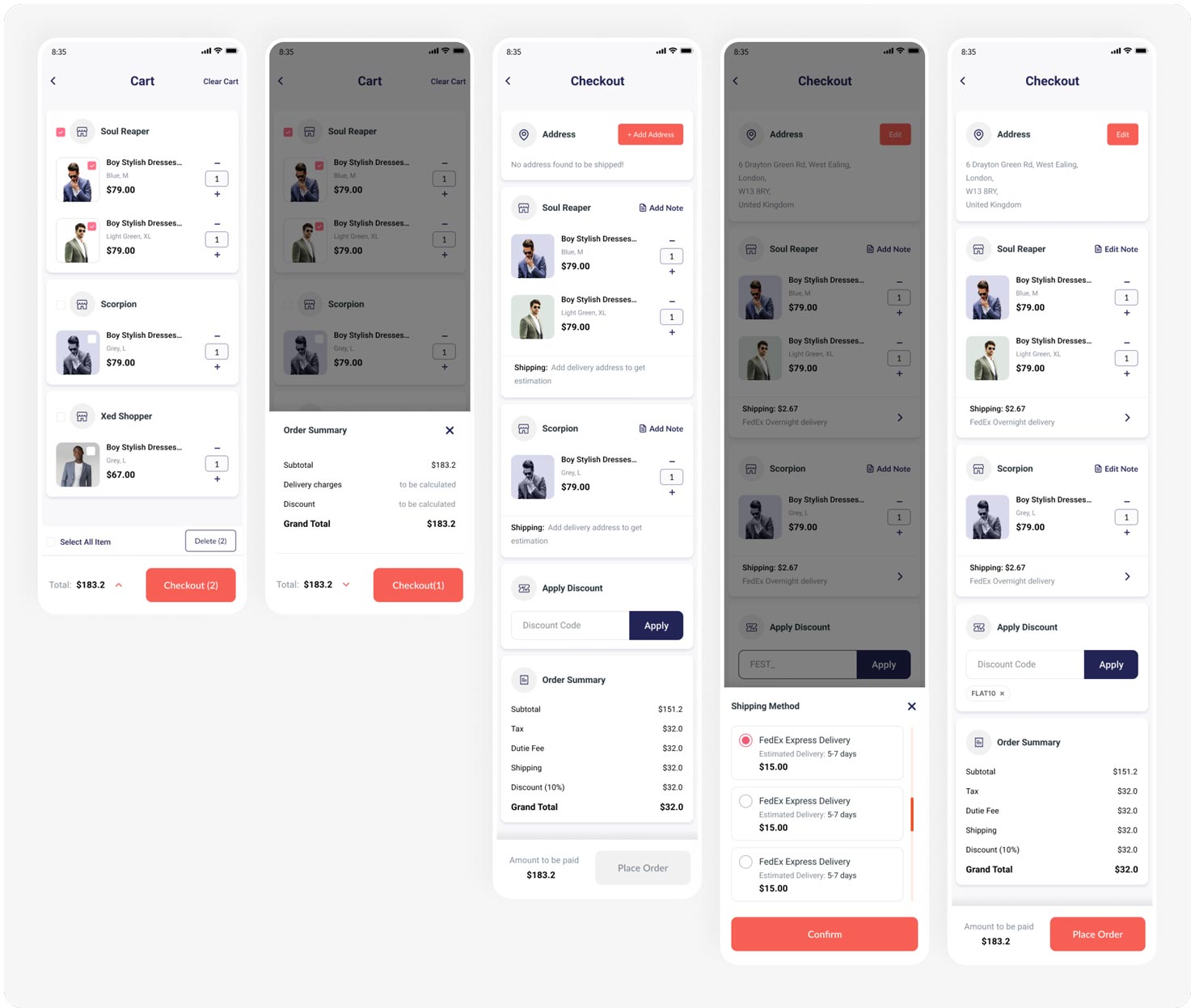
Following the completion of the second design iteration, I once again collaborated with the mobile developer to collect feedback. During this review, I identified additional functional limitations in the mobile application checkout process for this release.
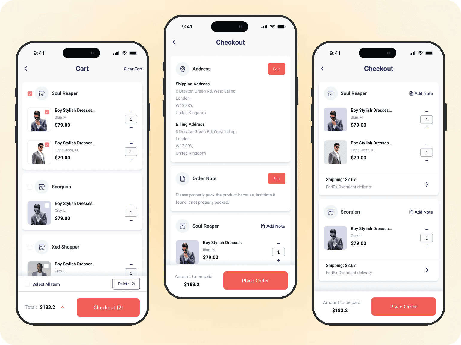
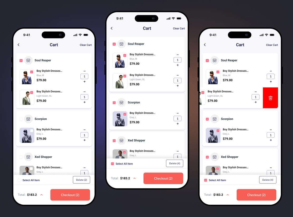
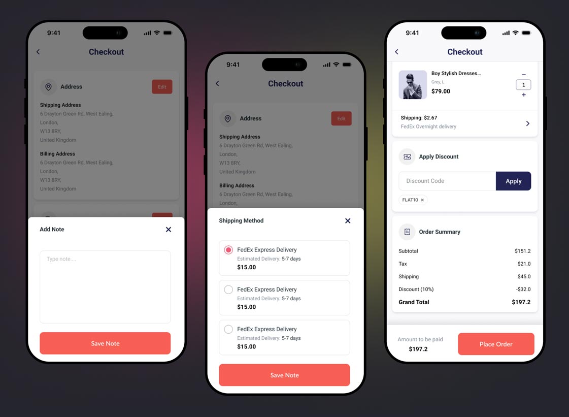
On the cart page, users have the option to select multiple products. Additionally, they can choose to proceed by selecting a specific seller, limiting their display to products from that seller alone. Furthermore, the cart can be easily cleared using the “Clear Cart” button, allowing users to delete either multiple selected items or a single item.
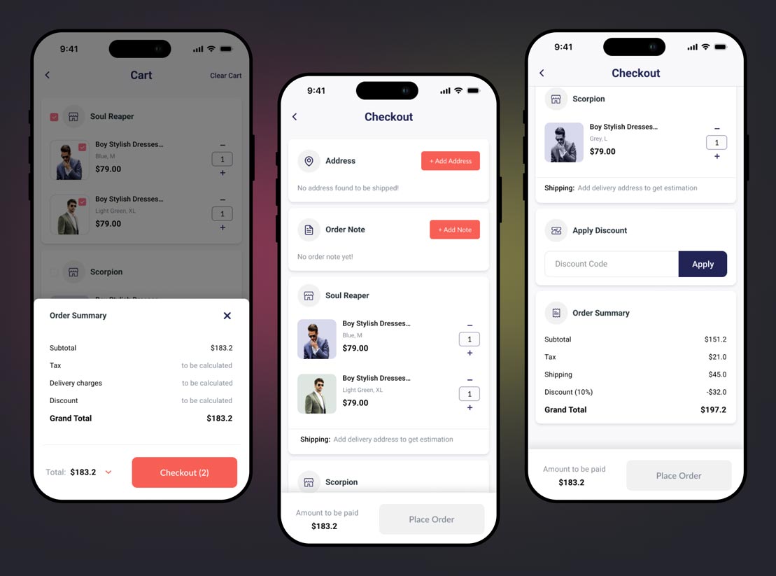
Starting from the cart page, the user will receive information about potential charges, eliminating confusion in the later stages of checkout. The user can input their address and note sequentially, receiving a comprehensive overview of the grand total before placing the order.
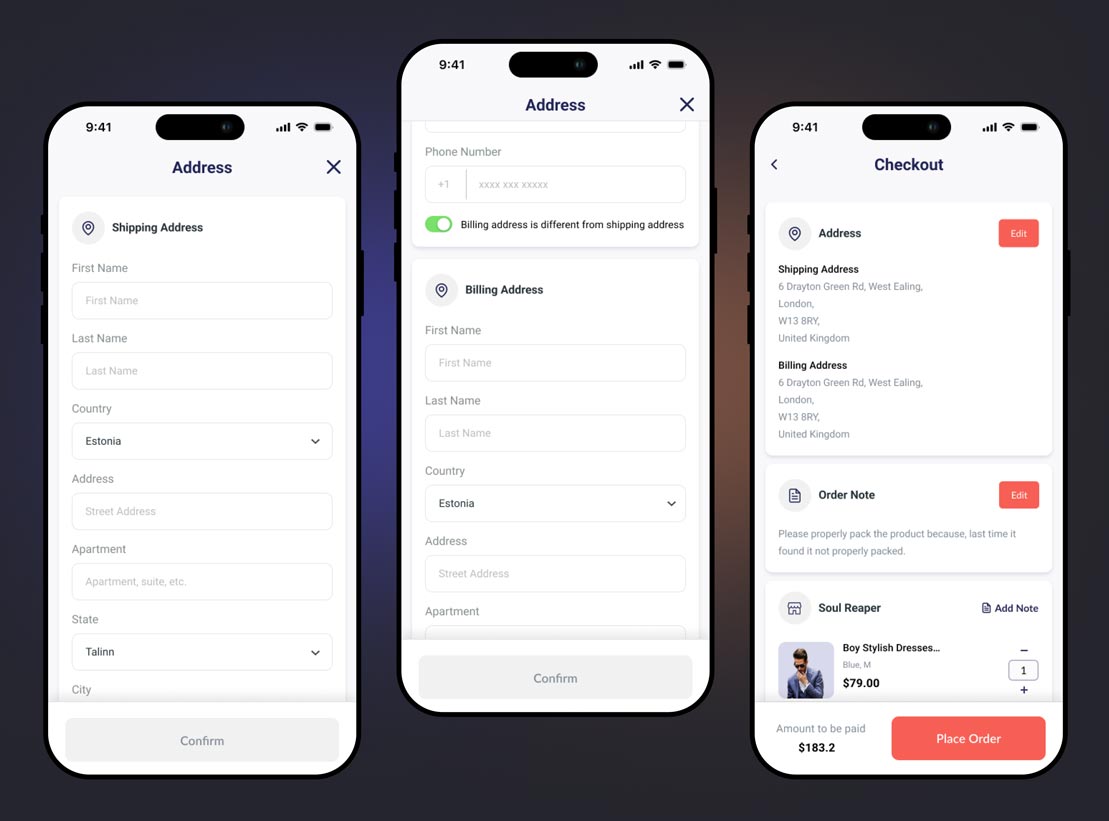
The calculation of shipping and other estimates is contingent on the provided delivery address. Therefore, it is crucial for users to input their address first. Additionally, if a user has a billing address different from the shipping address, they can specify that. However, due to WordPress not storing saved addresses, the mobile app does not have the capability to offer saved addresses.
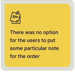
Users have the option to add notes specific to a particular order; however, functional limitations prevent the inclusion of seller-based notes. To enhance user accessibility, the features of adding notes and changing the shipping method have been conveniently placed below. The shipping method can be changed for each vendor, and, just before confirming the order, users can review the total cost and its detailed breakdown.
CHALLENGE #1
In mobile app the users already sign up with their credential so, there is requirement for guest checkout as all the data will be saved as per the user account.
CHALLENGE #2
Individual order note is not possible for application right now because WordPress only support single order note for a order. So for this functional limitations have to be counted.
CHALLENGE #3
In the present architecture of application payment is only possible from the plugin so user won’t be able to pay for the order from the mobile app. So designed has been changed according to that.
Upon completing the design and development of the new cart and checkout system for the mobile application, we conducted testing internally within our team and also sought feedback from some of our customers. Following a thorough review of the feedback and testing insights, we observed a highly positive outcome, with the new checkout flow exhibiting a significant increase of 23.9% in the conversion rate.
Upon concluding the project, I gained valuable insights into the cart and checkout system of an e-commerce mobile application. I encountered challenges related to technical limitations and aligning with the project’s scope and requirements. Nevertheless, I endeavored to devise optimal solutions within the given constraints. I remain hopeful that in the future, if the project scope expands, I can further enhance the system. While the current results are promising, I aspire to conduct qualitative research in the future, aiming to deliver more value and implement the most viable solutions for the cart and checkout process of Dokan mobile app.
