WORDPRESS PLUGIN / MULTIVENDOR / UX
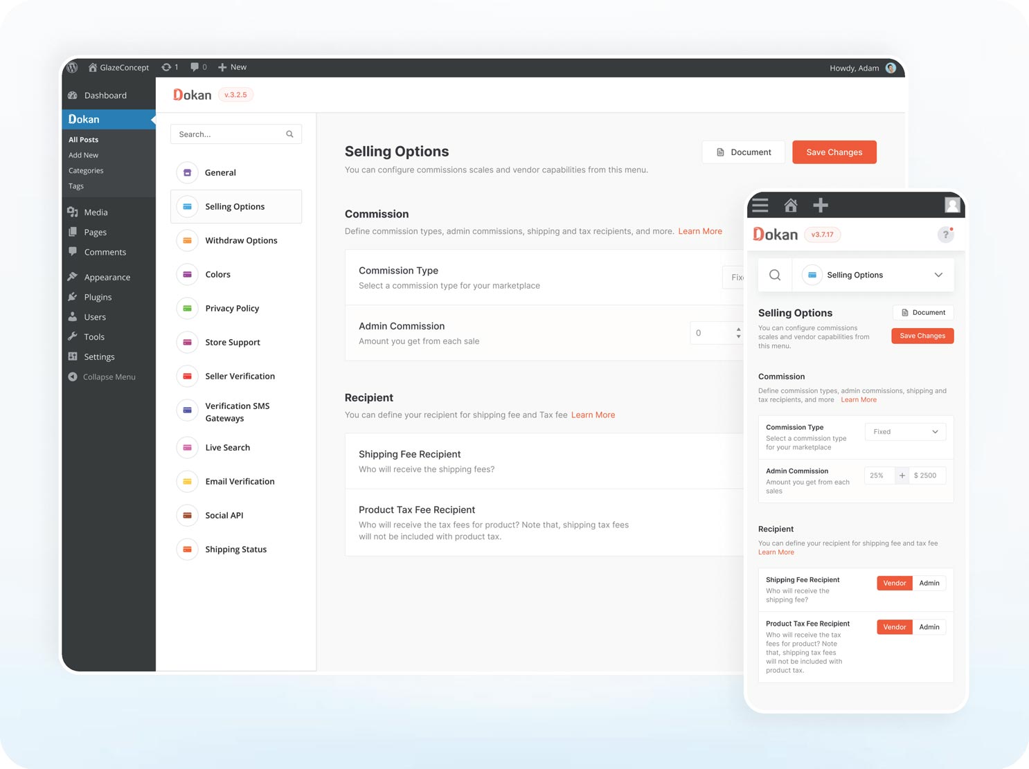
Effectively overseeing commissions and vendor profiles in a multivendor marketplace is a crucial capability. For an administrator, a portion of the earnings is contingent on vendor commissions. However, since vendors may offer diverse products, commission rates vary for each product. Additionally, administrators have the flexibility to set distinct commission rates for different vendors.
Our team’s objective is to streamline this control for administrators, recognizing its significance within the marketplace. We aim to enhance the administrator’s comfort in managing vendor profiles, ensuring easy oversight and maintenance of all vendors in the marketplace.
Dokan, weDevs
WordPress Plugin, Design, Multi vendor
Product Designer
4 weeks
Research, Wireframing, Ideation, UI Design, Figma.
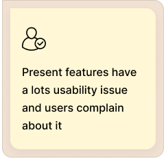
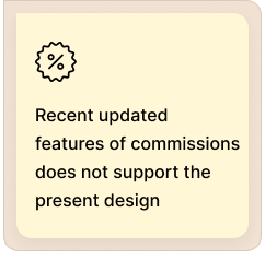
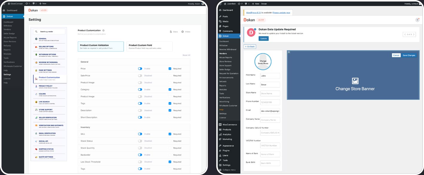
Lately, we’ve aimed to enhance the flexibility for marketplace administrators in setting commissions. As a result, our existing design no longer aligns with the current functionality. Additionally, the present commission feature lacks responsiveness, posing challenges for administrators attempting to manage controls via mobile devices. Moreover, the current vendor profile editing feature lacks comprehensive functionality and exhibits numerous usability issues.
Addressing these issues, our challenge is to make the updated commission and vendor profile features more user-friendly, ensuring administrators can seamlessly navigate and utilize our recent enhancements with greater ease.

The initial mobile checkout incorporated commendable practices; however, my objective was to enhance its effectiveness within a multivendor system and boost conversion rates on both the cart and checkout pages. Here is the representation of the previous design for reference.
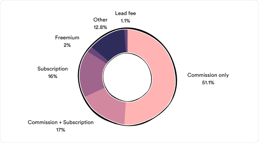
During the research phase, I collaborated with the product analyst team to investigate how the commission system currently operates among competitors. Our aim was to identify potential areas for flexibility in our commission and vendor profile features. Additionally, we were mindful of functional limitations to ensure that we proposed feasible solutions for development.
Following an in-depth analysis of various competitors, our product analyst team and design team has uncovered valuable insights. To enhance clarity, we have organized these insights into categories, highlighting what needs to be introduced and what requires updating to ensure the usefulness of the features for our users.
INSIGHTS #1
Admin should be able to set commission based on the sellers. So that maintain the growth in his marketplace and commission rates may vary based on a vendor’s performance, sales volume, or loyalty to the marketplace.
INSIGHTS #2
Implement an automated system for commission calculations to reduce errors and save time. This ensures accuracy and efficiency in processing payments.
INSIGHTS #3
Ensure that the admin dashboard, including commission management tools, is responsive and accessible on various devices. This enables administrators to manage commissions efficiently, even on mobile devices.
INSIGHTS #4
Provide the admin with the flexibility to set different commission rates for various vendors or product categories based on the marketplace’s business model.
Once we determined the additions and update we wanted for our commission and vendor profile, I collaborated with the analyst team to generate wireframes. By visualizing our ideas through wireframes, we aim to enhance clarity, enabling us to share and gather insights from other team members for further improvements.
We’ve utilized the data to create a wireframe for the commission page in the Dokan Plugin, and it’s now prepared for presentation to our team members.
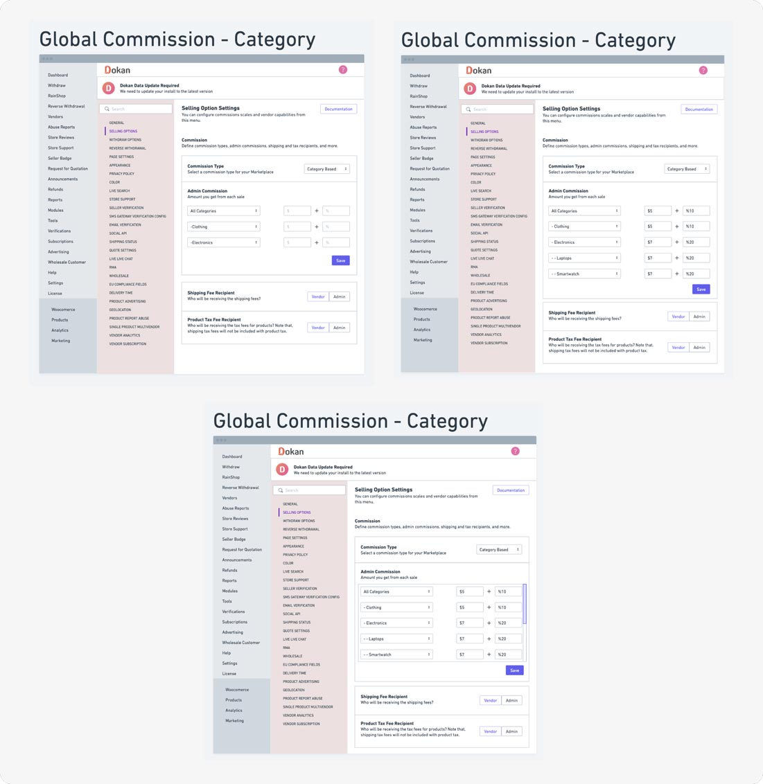
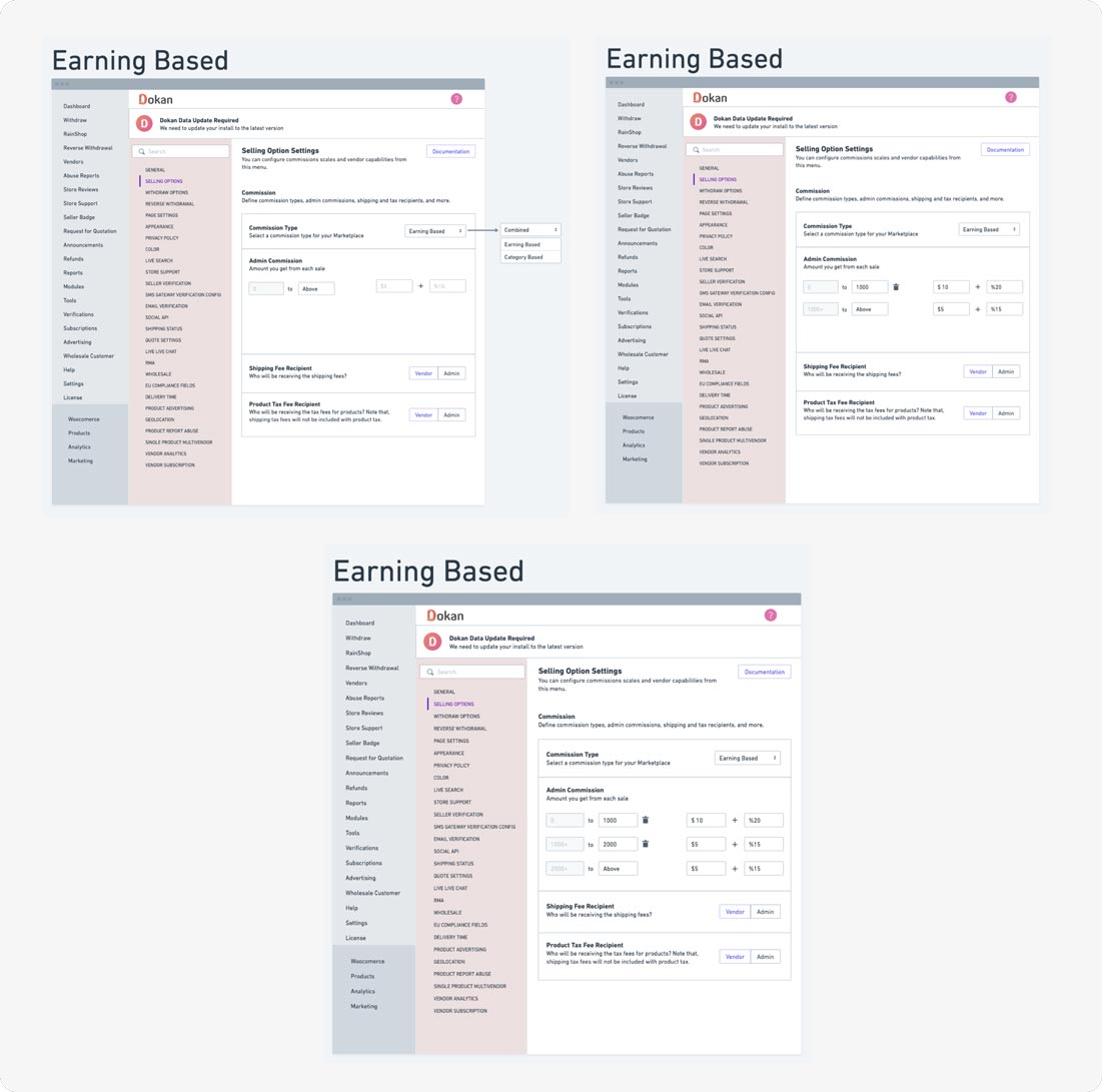
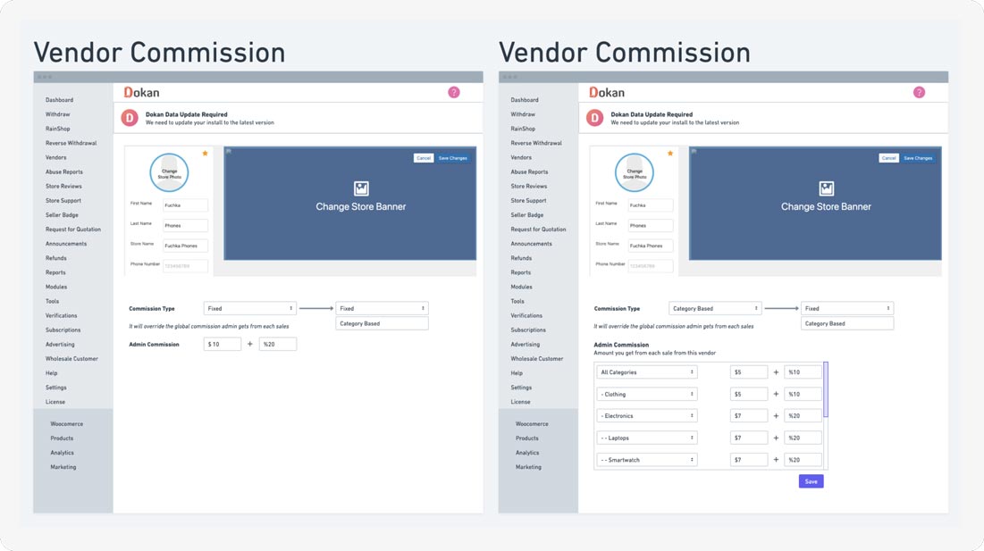
The vendor profile preview section was designed earlier, and as a result, only the wireframe for the vendor profile commission page has been presented.
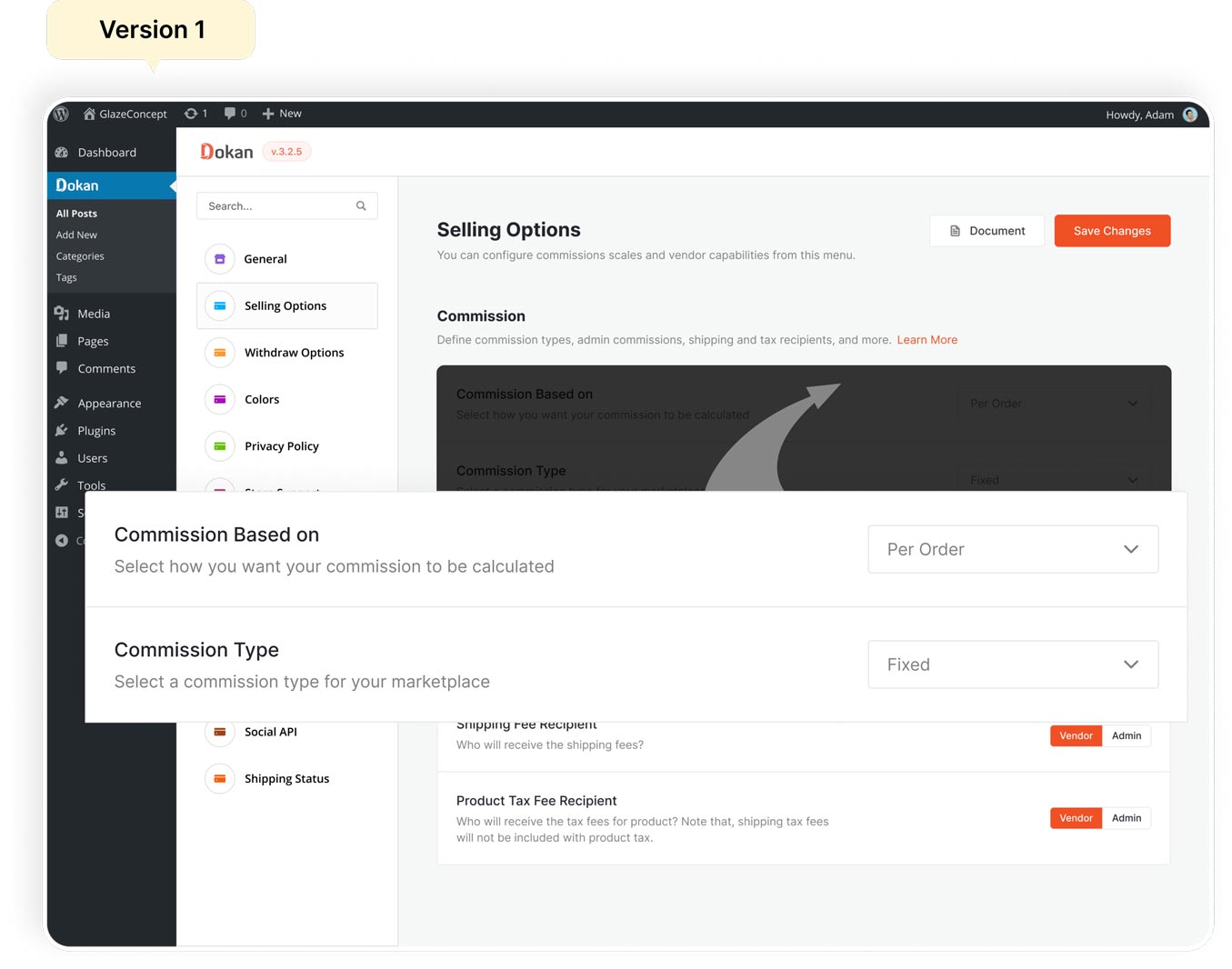
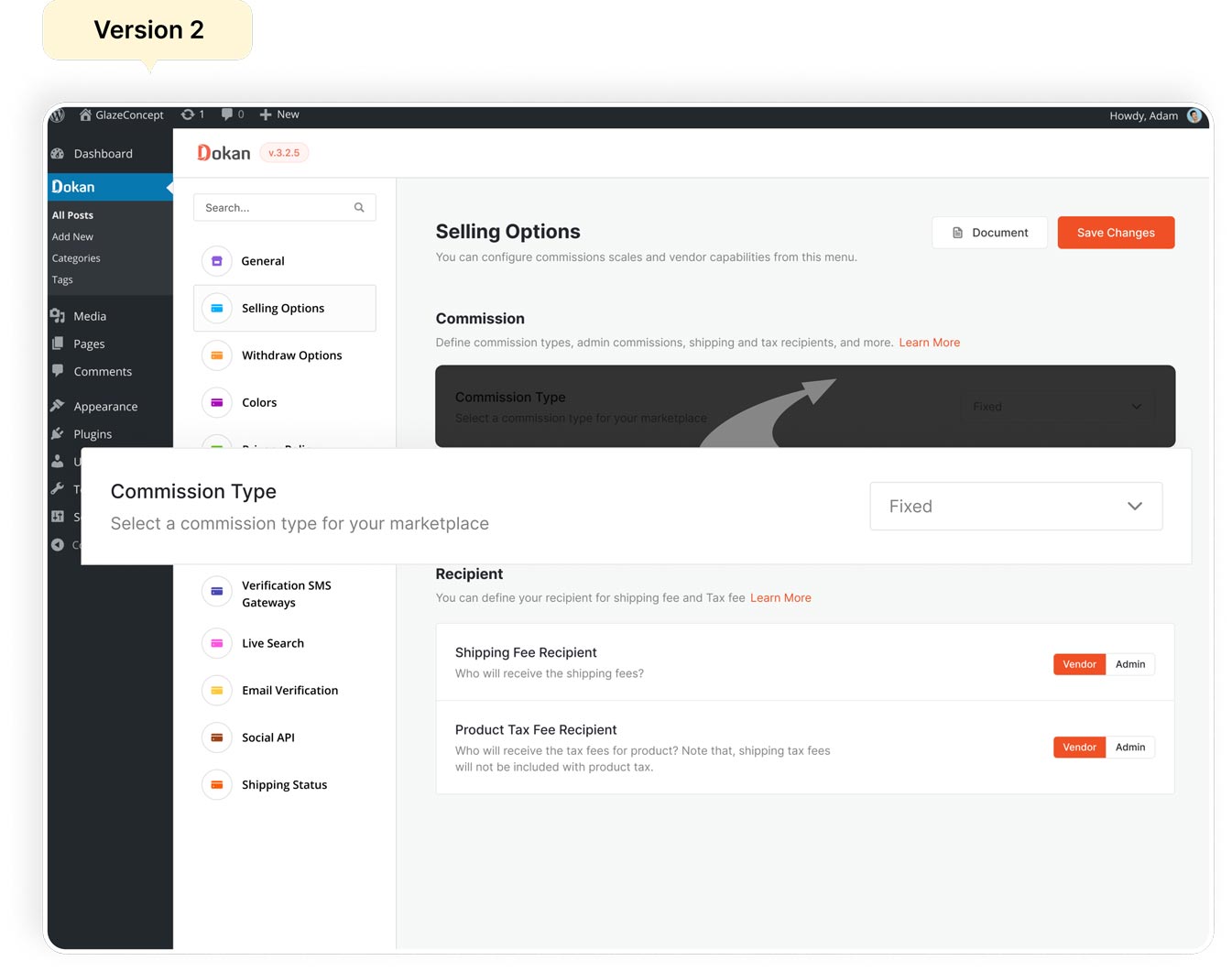
Designs almost never get approved in a single version. So before getting through the final design there are lots of design version been made and i have showcased them below.
As initially we are ideating about how we can calculate commission in a cart where different type of seller have different type of commission to pay. So after ideation we came up with some variation of solution which I have showcased the visual part below.
For vendor profile it’s a confusion for us to decide how much information we need to showcase in a overview page. how efficiently admin can overview information which he might be looking for. So after ideation i have came up with this visual dosing variation.
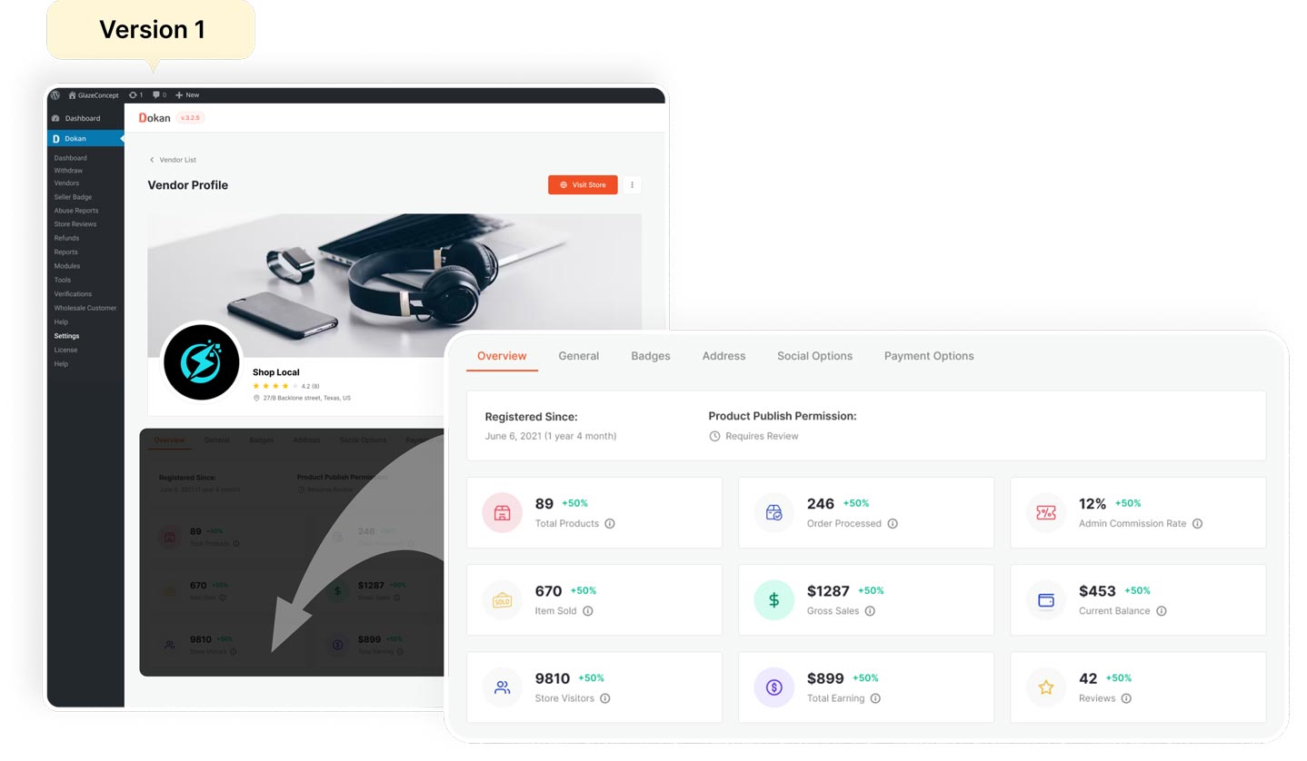
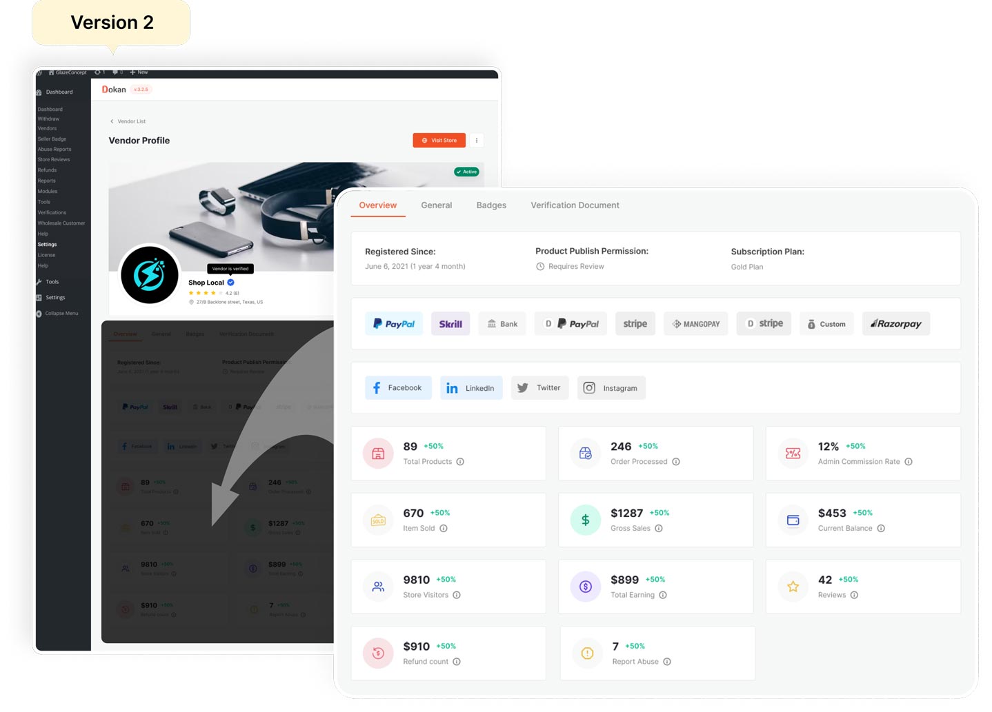
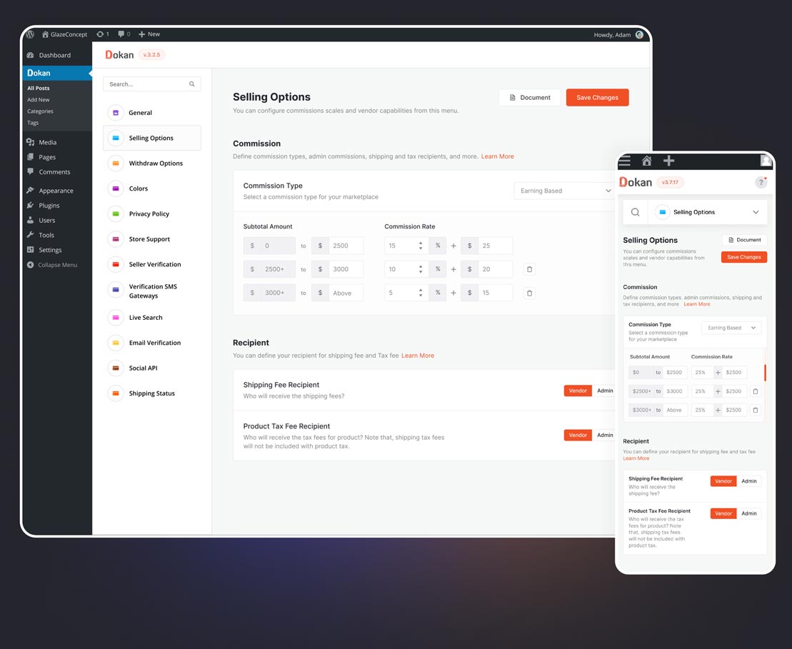
After completing various design iterations and collecting feedback, we have chosen the design presented below as the final one. This design effectively addresses our functional requirements and aligns seamlessly with our solution.
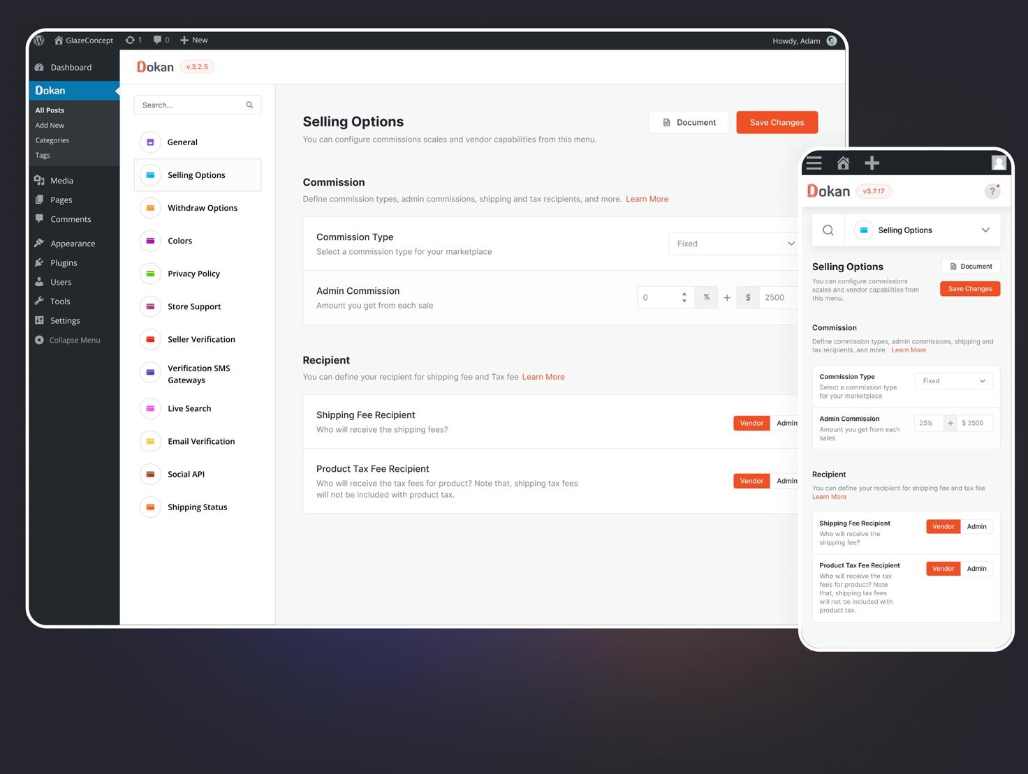
With fixed-based commission, the admin can establish a set commission rate applicable to all types of products. In this scenario, every vendor within the marketplace will be subject to the same commission amount.
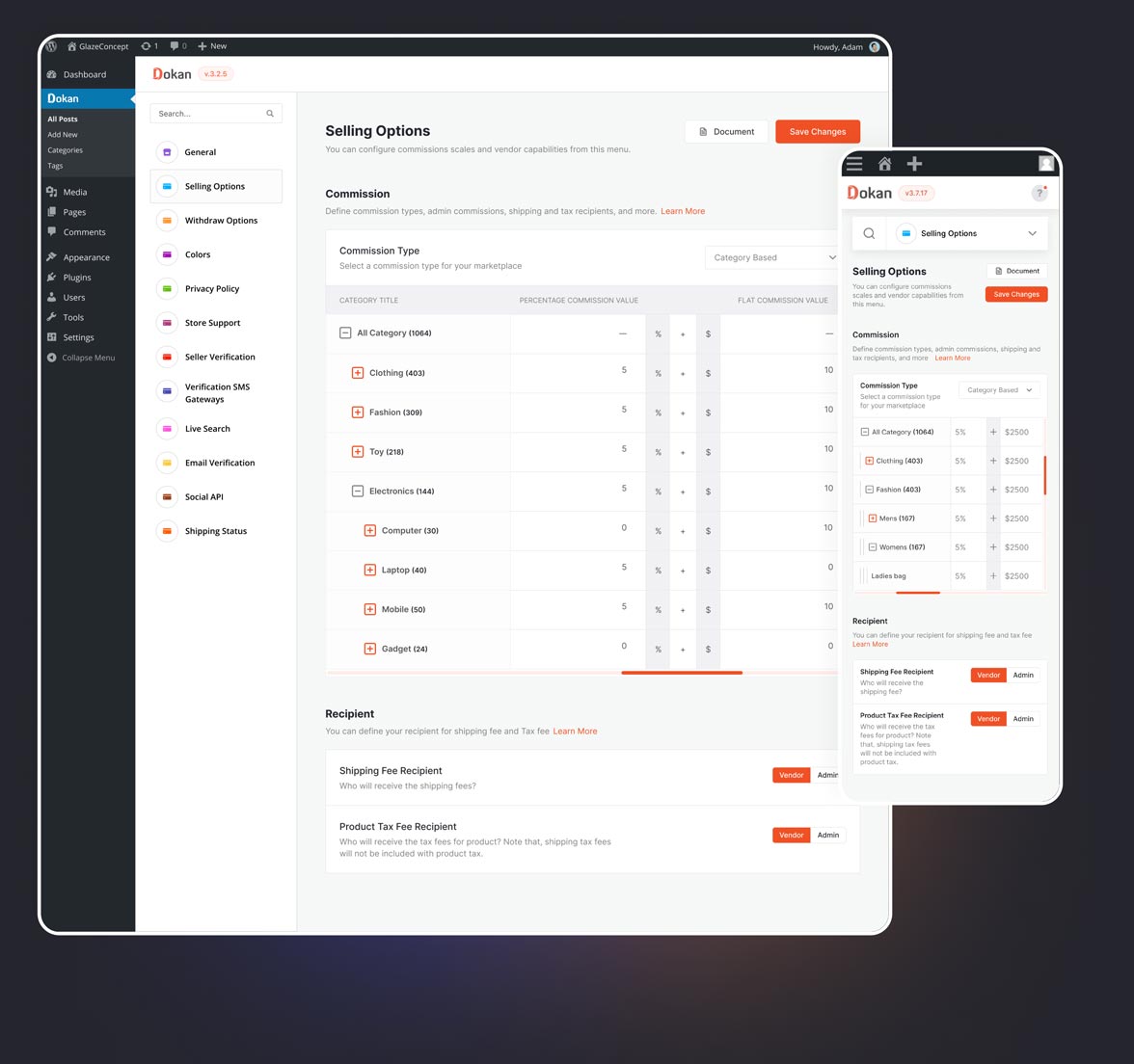
Under the category-based commission model, the admin has the flexibility to set commission rates based on different product categories. This means that the admin can choose to increase the commission for a specific category or decrease it for another, providing a tailored approach to commission management.
With earning-based commission, the admin can establish their commission rates based on earning ranges. In this model, the admin receives commission based on the overall earnings, rather than being tied to specific categories or product types.
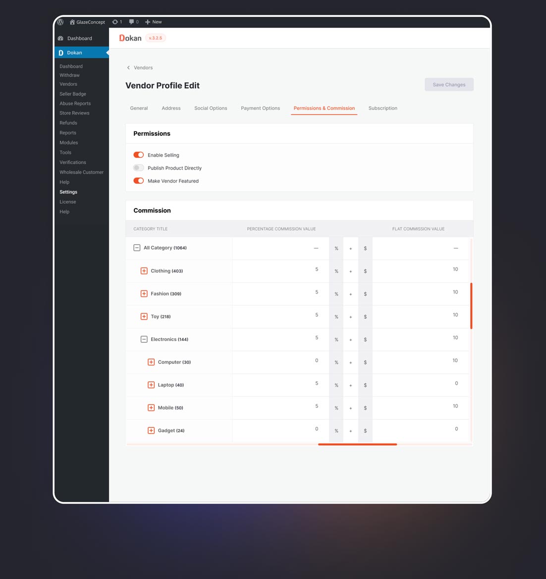
The admin has the capability to assign specific commission rates for individual vendors. This allows the admin to recognize and reward sellers based on their loyalty and sales performance.
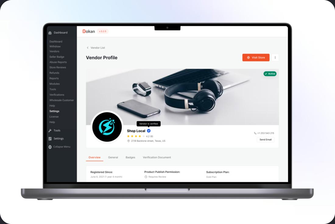
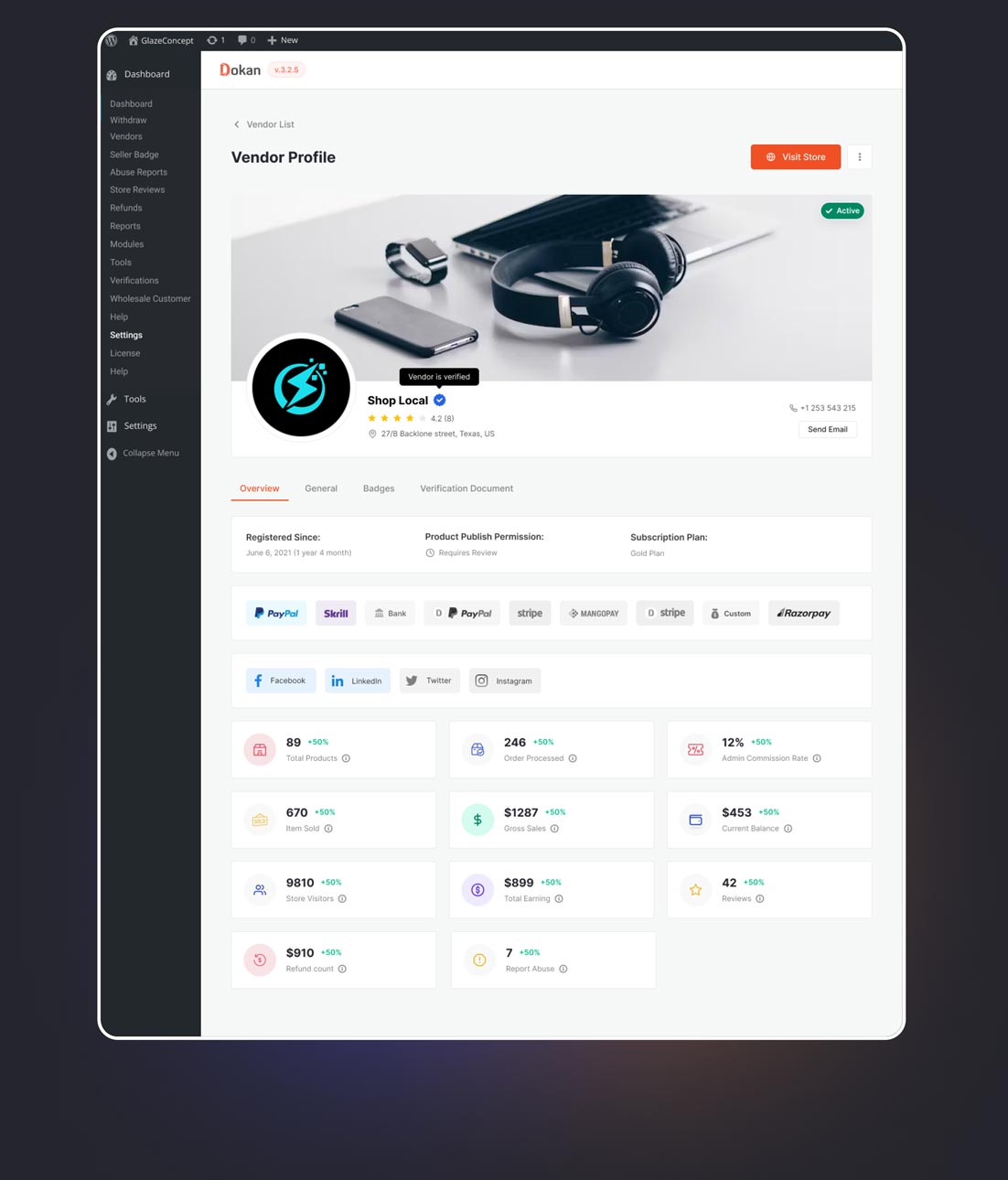
In addition to redesigning the commission feature within the vendor profile, I also had the opportunity to revamp the layout of the vendor profile view. This provides the admin with a comprehensive overview of the vendor’s details at a glance.
CHALLENGE #1
The presence of various commission types posed a challenge for us in accurately calculating the admin’s commission. The introduction of these new features has effectively addressed and resolved this issue.
CHALLENGE #2
In the previous design, it was challenging for the admin to quickly access essential information about a specific vendor. However, in the current design, the admin can obtain the necessary information with just a few clicks.
CHALLENGE #3
Setting category-based commissions was challenging for the admin in the previous system due to the abundance of categories. However, in the current design, the admin can easily configure parent-based and nested category commissions.
Upon concluding the design and aligning everyone on the team with the same vision, the opportunity for end-user testing did not arise. However, we conducted internal testing within our team, leveraging individuals with insights into end-user experiences. The results revealed that users can complete the commission setup 37% faster than before, with a reduction in errors.
Upon project completion, numerous opportunities for improvement persist, and there is still a chance to obtain real user insights that can contribute to further enhancing these features. As a team, we have decided to conduct user testing post-release and aim to implement improvements in our subsequent release.
Furthermore, this project provided me with valuable insights into the intricacies of commission structures in a multivendor platform and their efficient functioning for marketplace administrators. I look forward to expanding my knowledge in this area whenever there is an opportunity in the future.
