WEBSITE DESIGN / E-COMMERCE / UX
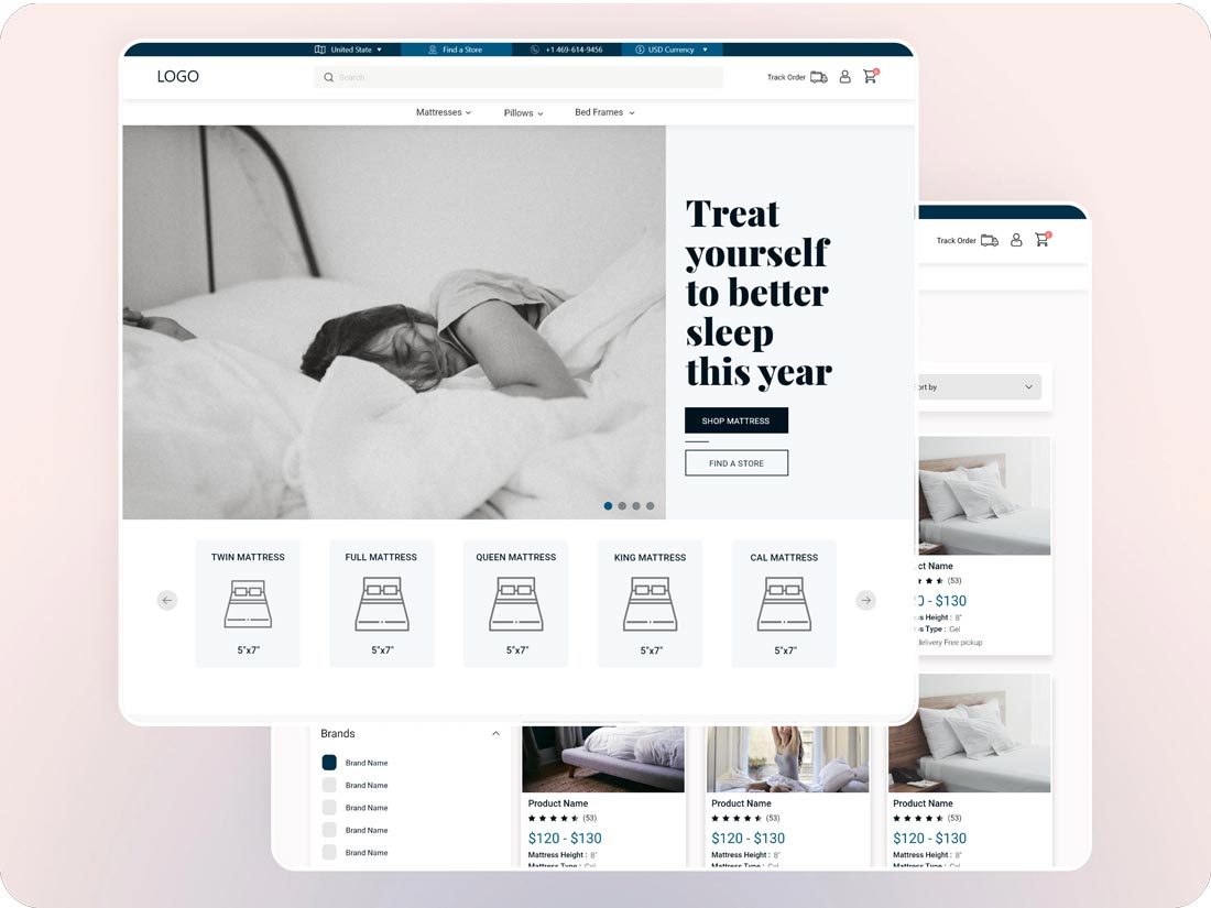
A mattress is often perceived as a utilitarian necessity, acquired as an essential element of daily life. Unlike fashion or luxury products, its appeal lies predominantly in its features and comfort. Consequently, replicating the tangible experience of a physical mattress store on a website can pose challenges.(The logo have been replaced on purpose)
The primary goal of this mattress website is to recreate an online experience that closely mirrors an in-person visit to a mattress store. As a UI/UX designer, my role is to craft a seamless and relatable journey throughout the website, ensuring users feel at ease and confident when making their mattress purchases.
Mattress Company & DesignNearMe
E-commerce, Website, Design
UI/UX Designer
3 weeks
Adobe XD, Wireframing, Adobe Suite,
Balsamiq, Research, Prototyping, Visual Design.
At the outset, e-commerce shoppers miss the opportunity to physically inspect and experience products as they can in brick-and-mortar stores. Furthermore, the vast product selection often leaves them perplexed in the absence of adequate guidance. Adding to the challenge, there’s uncertainty about product dimensions and suitability for their needs, resulting in a complicated decision-making process.
Additionally, shoppers grapple with questions regarding the logistics of delivery and the procedures for returning items in the event of issues or dissatisfaction. Furthermore, currency conversion can lead to confusion when trying to estimate costs.
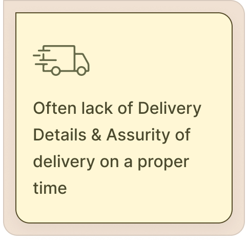
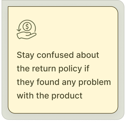
While established competitors such as Casper, Purple, and Tuft & Needle have excelled in offering a diverse range of products, competitive pricing, effective distribution and sales channels, our mattress company should prioritize enhancing the user experience in terms of delivery and refund processes, establishing trust through a reliable payment gateway, optimizing currency conversion, and providing comprehensive product details on our website.
Nonetheless, it is essential to take into account Casper’s strong customer reviews and reputation and Purple’s technology and innovation as we fine-tune our strategic approach. Our continued success will hinge on a commitment to ongoing innovation, responsive customer support, and forging strategic partnerships, all of which are pivotal in maintaining our competitive advantage.
Initially competitive analysis gives us some insight about the market competitors. What the competitors are doing good in and where we can do better to have some good competitive edge. Besides, that I want to narrow down our users, finding out their needs, pain points, their goals and what makes them comfortable. Also I will try to find out which solutions suits better for users and the business.
After researching I have figured out there can be many users who can use our platform but mostly 2 age group of people purchase frequently. First group of people buy Mattress as they want to set up their first home or apartment. And second group of people look for the replace their mattress and they prioritize the online research, review most.
– First Age Group (18-34)
– Second Age Group (35-54)
Tried to research specifically based on learning curve, website builder usability, and right-to-left conversion issues.
– 49% of the digital shoppers pay via Digital/mobile Wallet.
– 18% of the digital shoppers abandon their cart because of hidden charges like taxes, currency conversion, etc.
– 23% of the digital shoppers leave the website because of Digital payment failure
– 21% of the digital shoppers feels frustrated because of delivery delay.
Tried to find out what type of functionality are preferred by our digital shoppers
– Detailed Product Information: Provide comprehensive product descriptions, including mattress type, materials, dimensions, firmness levels, and unique features. High-quality images and videos showcasing the product from various angles can also help customers make informed decisions.
– User Reviews and Ratings: Display authentic user reviews and ratings to build trust and help shoppers understand the real experiences of other customers.
– Customization Options: Offer customization features, such as the ability to select mattress size, firmness level, and other preferences to cater to individual needs.
– Clear Pricing: Ensure transparent pricing with no hidden fees or surprises at checkout. Include information about any discounts, promotions, or financing options available.
– Currency Conversion: If targeting international customers, provide currency conversion tools to display prices in users’ preferred currencies. This simplifies the purchasing process for shoppers from different regions.
– Easy Navigation: Create an intuitive website navigation structure that allows shoppers to quickly find the products they are looking for. Implement clear categories, filters, and search functionality.
– User-Friendly Checkout: Simplify the checkout process with a minimal number of steps and clear instructions. Offer guest checkout options for those who prefer not to create accounts.
– Visual Comparisons: Enable users to compare multiple mattress models side by side, highlighting key features, specifications, and pricing differences.
– Secure Payment Options: Accept a variety of secure payment methods, including credit cards, digital wallets, and other popular payment options.
– Shipping Information: Provide clear and accurate information about shipping costs, delivery times, and tracking options. Offer options for white-glove delivery and mattress setup, if available.
– Return and Warranty Policies: Clearly communicate return and warranty policies to instill confidence in shoppers. Highlight any trial periods or guarantees.
– Educational Content: Create blog articles, guides, and videos about sleep, mattress care, and related topics to educate and engage shoppers.
Drawing from the research findings and a compilation of collective data, an empathy map has been crafted to provide a clearer understanding.
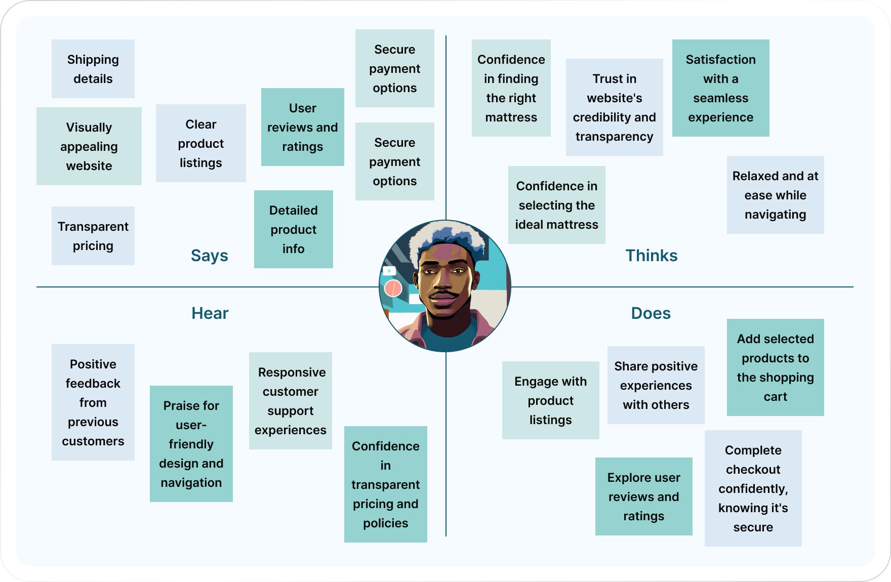
INSIGHTS #1
Shoppers value detailed product information, indicating a need for transparency in mattress specifications and features.
INSIGHTS #2
Clear and accurate shipping information, including costs, delivery times, and tracking options, enhances transparency and helps manage shopper expectations.
INSIGHTS #3
Accepting a variety of secure payment methods accommodates different shopper preferences and ensures a smooth payment experience.
INSIGHTS #4
A user-friendly and straightforward checkout process is vital. Providing guest checkout options respects shoppers’ preferences for simplicity.
INSIGHTS #5
Currency conversion tools are essential, especially when targeting international customers, simplifying the buying process for users from different regions.
INSIGHTS #6
An intuitive website structure with clear categories, filters, and search functionality helps shoppers find products quickly, improving user experience.
INSIGHTS #7
An intuitive website structure with clear categories, filters, and search functionality helps shoppers find products quickly, improving user experience.
INSIGHTS #8
User reviews and ratings are crucial for building trust and helping shoppers make informed decisions. Authentic user feedback is highly influential.
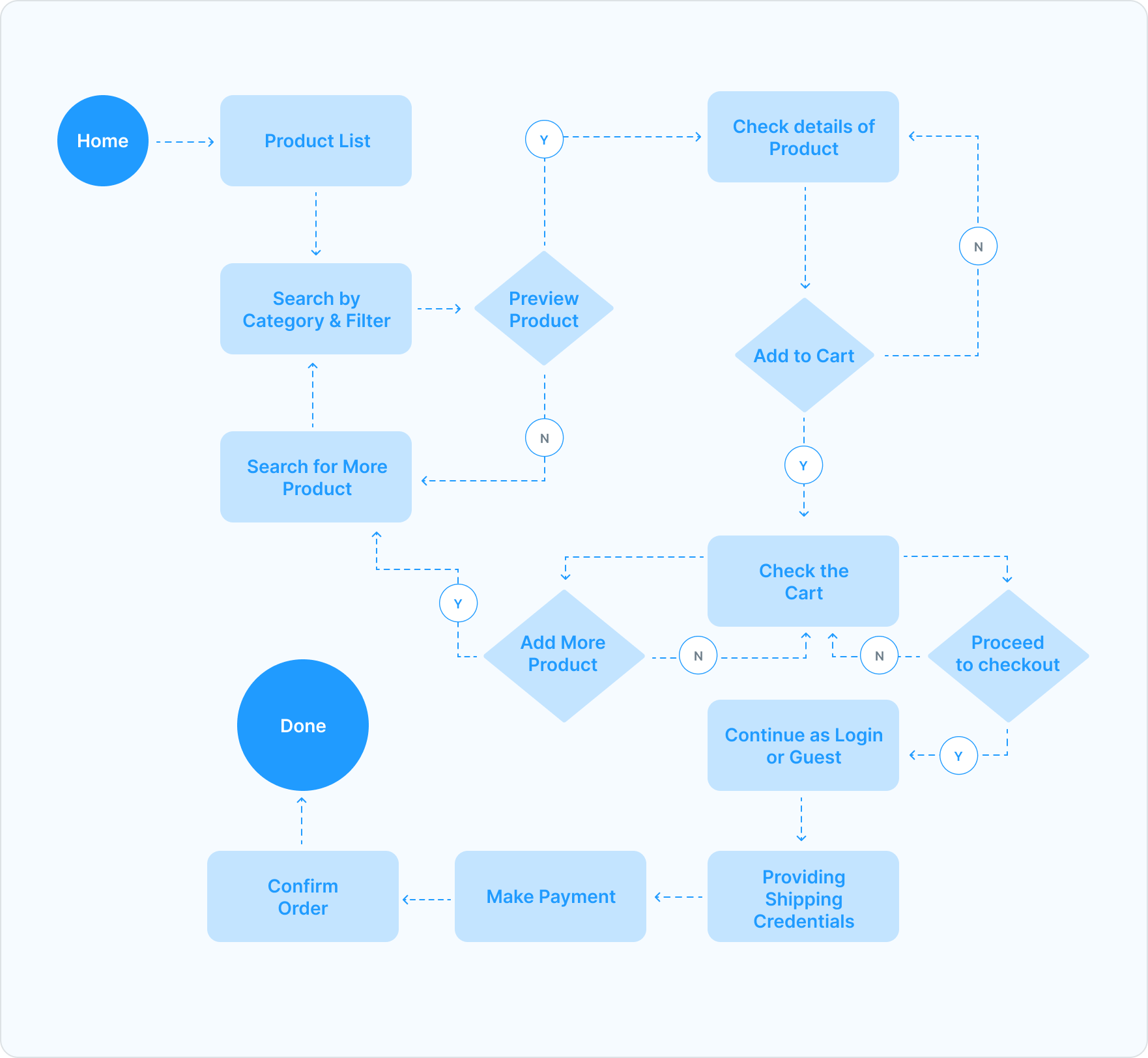
I’ve created a straightforward user flow outlining how digital shoppers will navigate their shopping journey on the website.
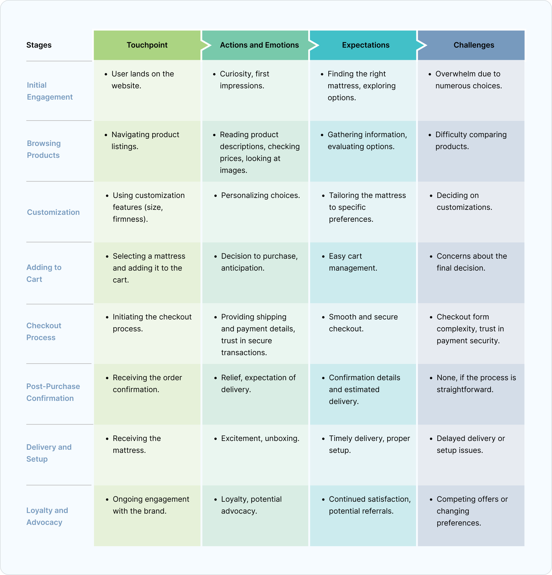
I’ve developed a fundamental customer journey to gain deeper insights into our customers’ expectations and the challenges they may encounter.
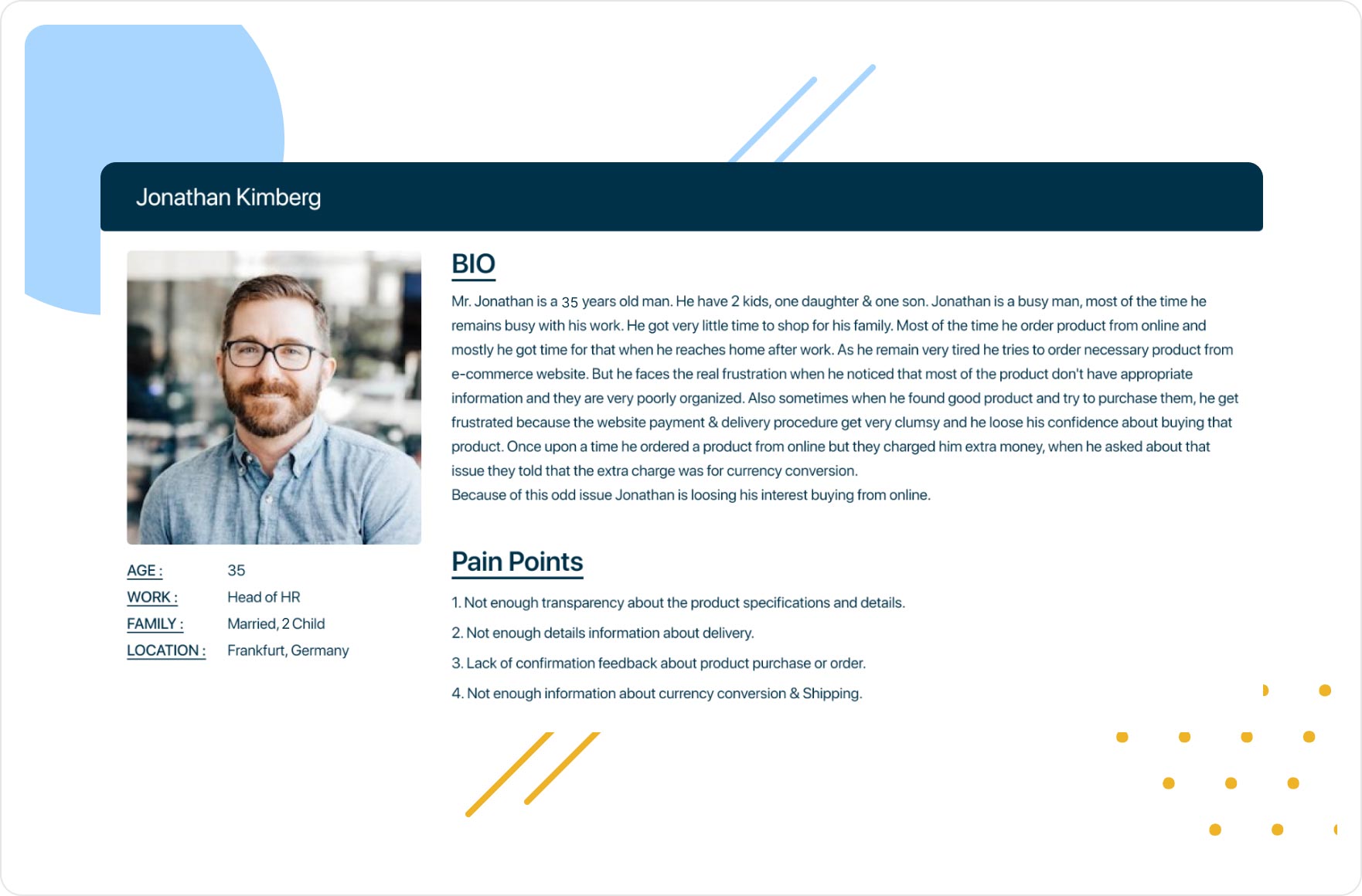
I have built a user persona based on the Information i have gathered.
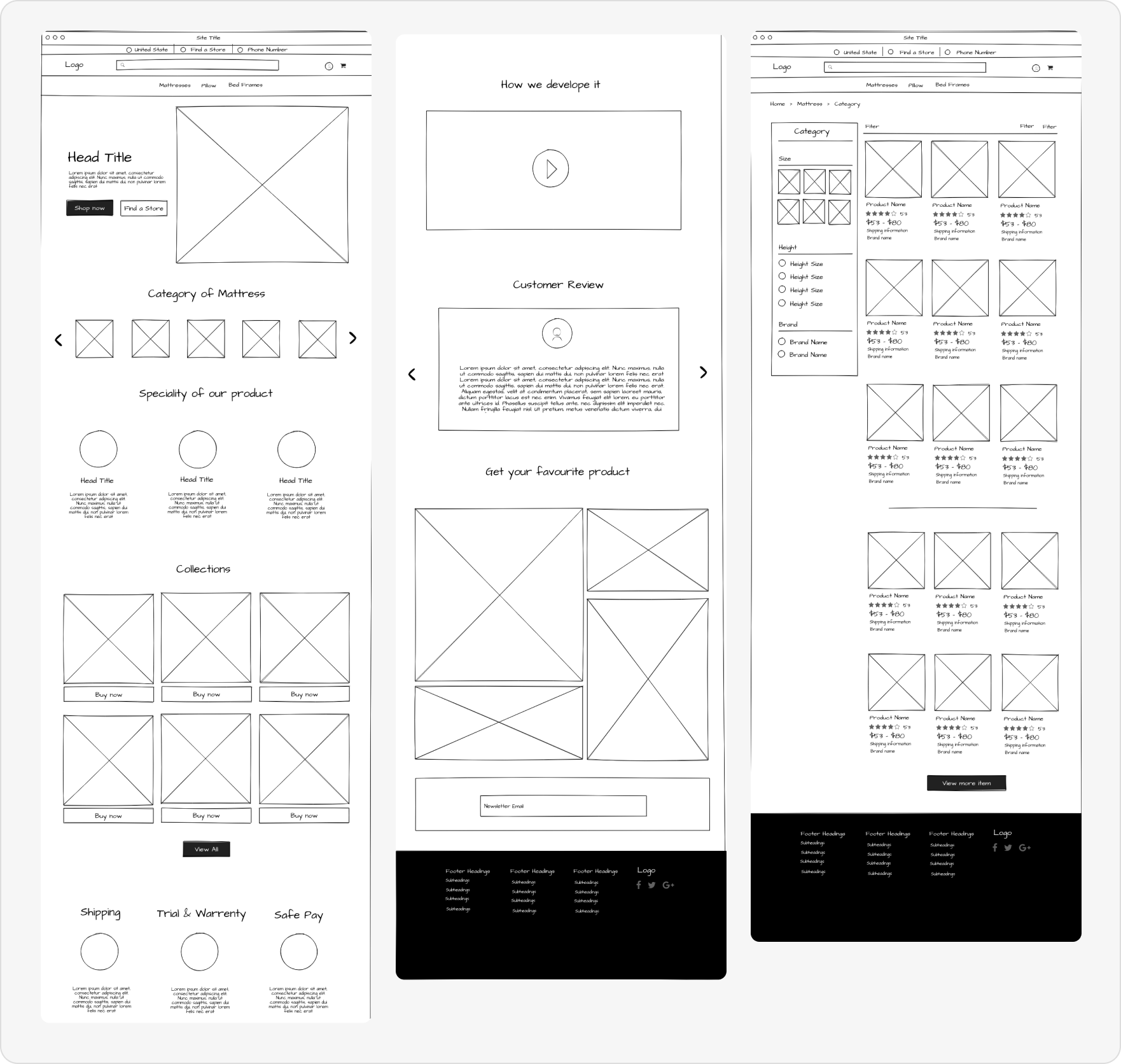
For this project, I created the wireframe using Balsamiq. The wireframe provides us with a clear visualization of the website’s structural layout.
At first glance of the homepage, users experience a sense of effective guidance, allowing them to effortlessly search for the products they need on their own.
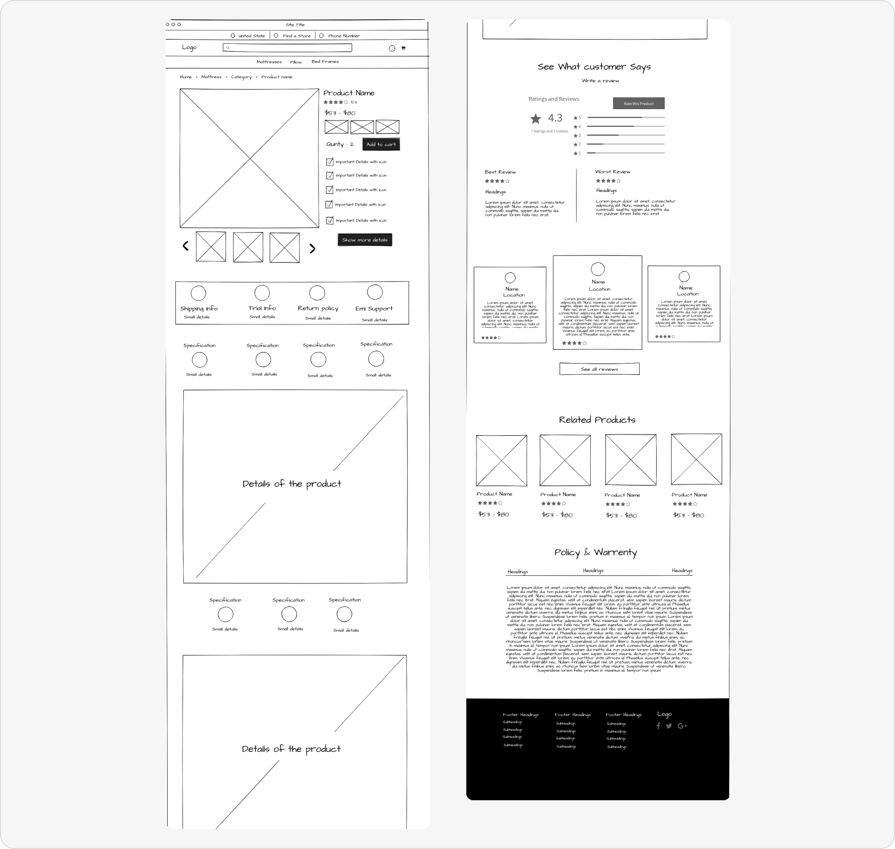
Empowering users with control to tailor the product to their preferences, providing essential details, ratings, and establishing trust to instill confidence in their purchase decisions.
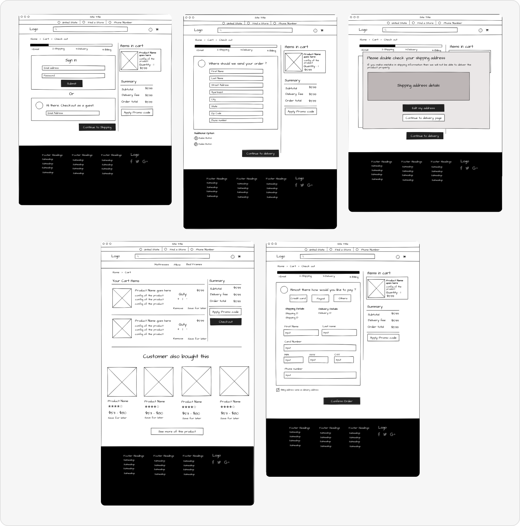
Fostering user trust at every stage, ensuring they have a clear understanding of the necessary information, its purpose, and how it contributes to a seamless delivery process.
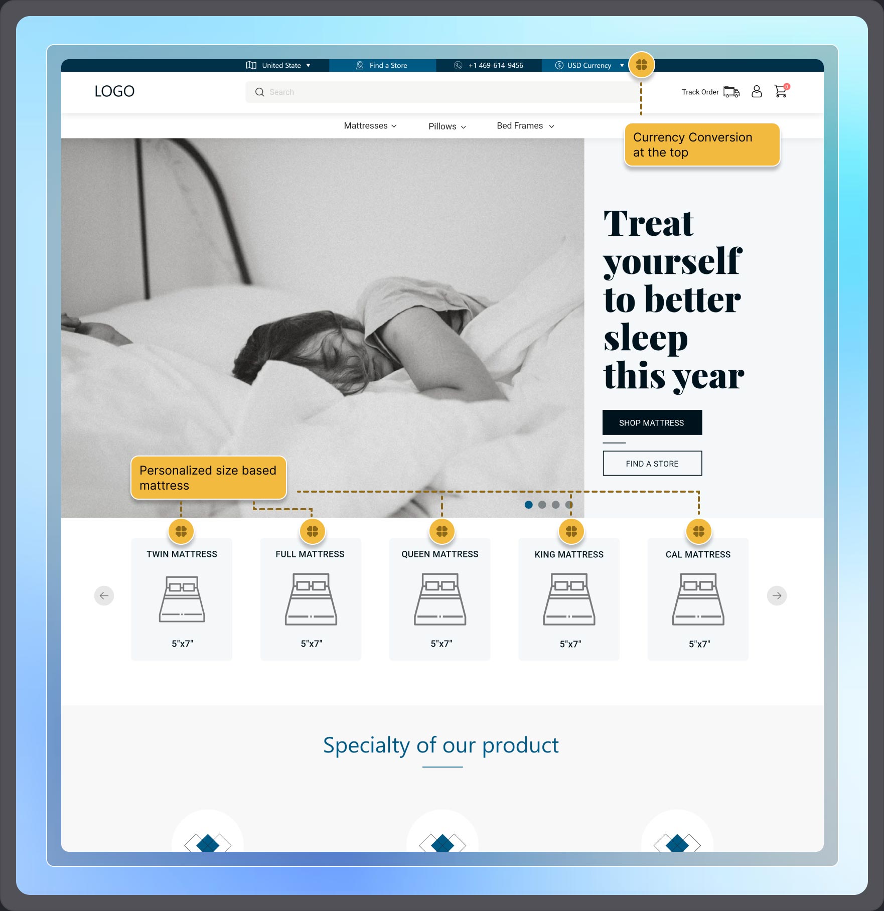
The website layout has been done through wireframe, now it’s time for the Visual design part. So, I have proceeded visual designing with keeping all the user pain point we can solve.
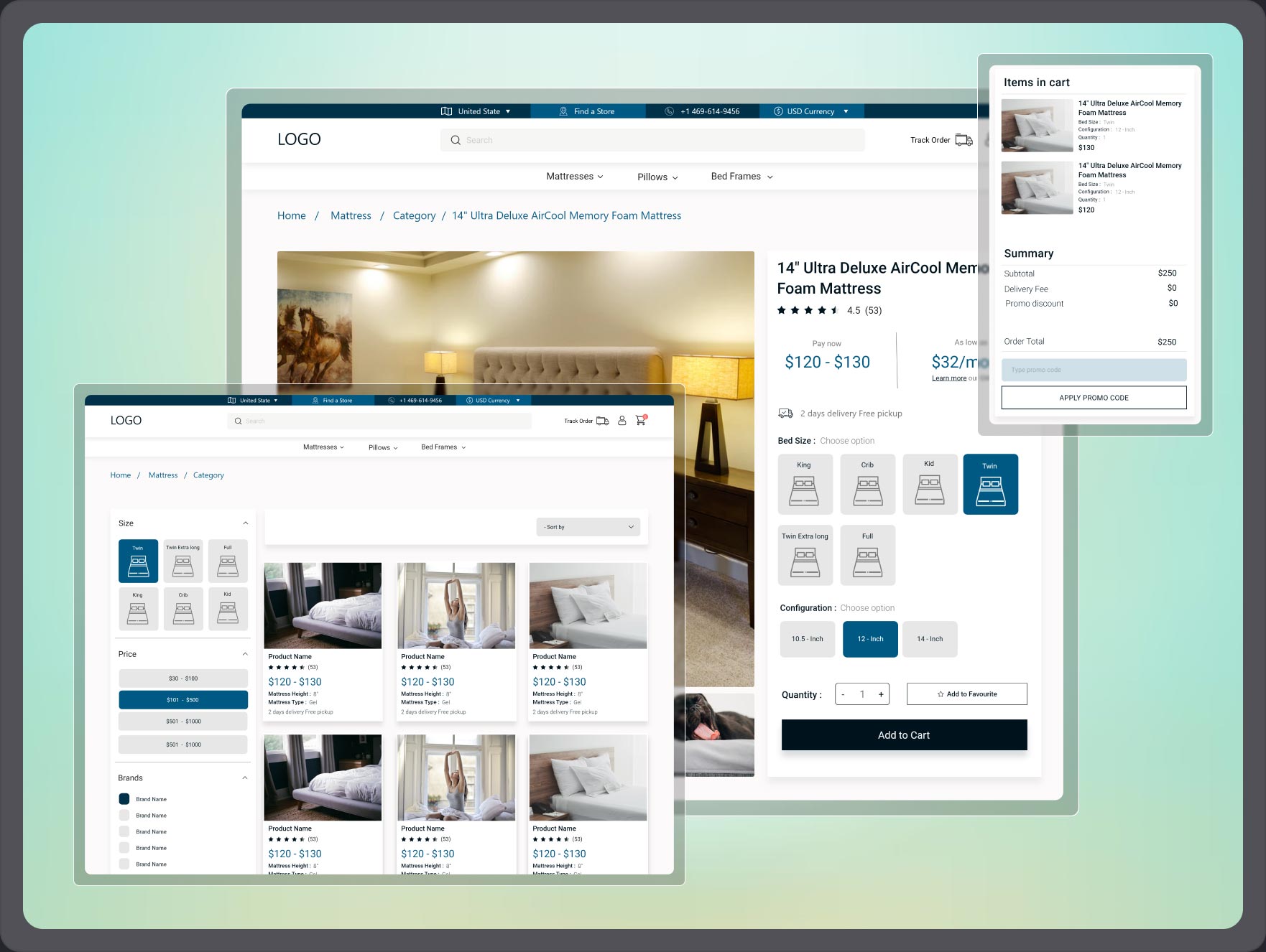
From the first view of the homepage user will get a personalize view as the currency of the whole website will showcased based on the user’s location and they can change it. Also, they will see the mattress according to the measurement.
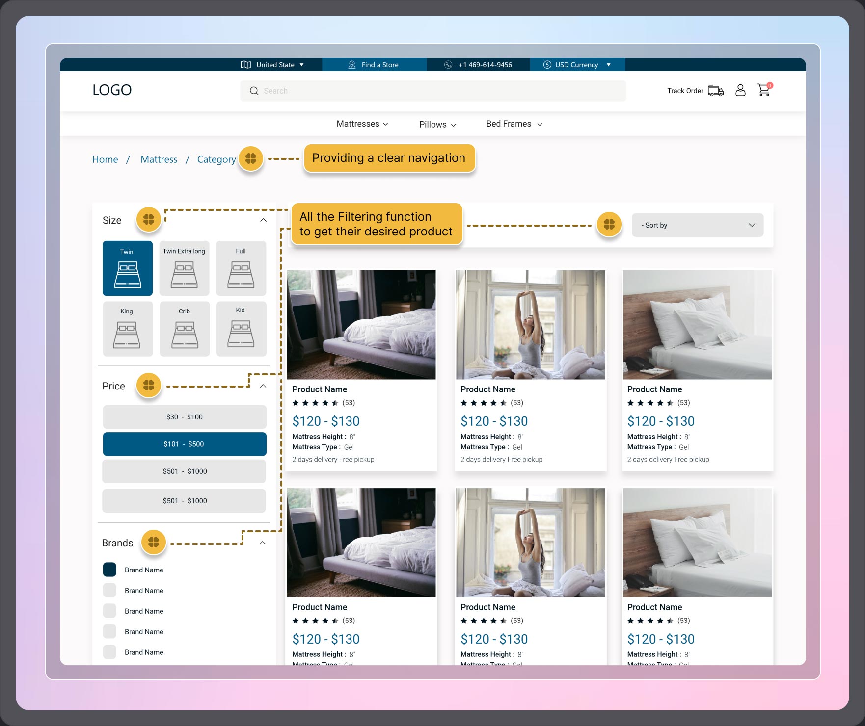
Ensuring transparent navigation that helps users understand their current location and provides an accessible path to return. Moreover, they can effortlessly refine their product search through convenient filtering and sorting functions.
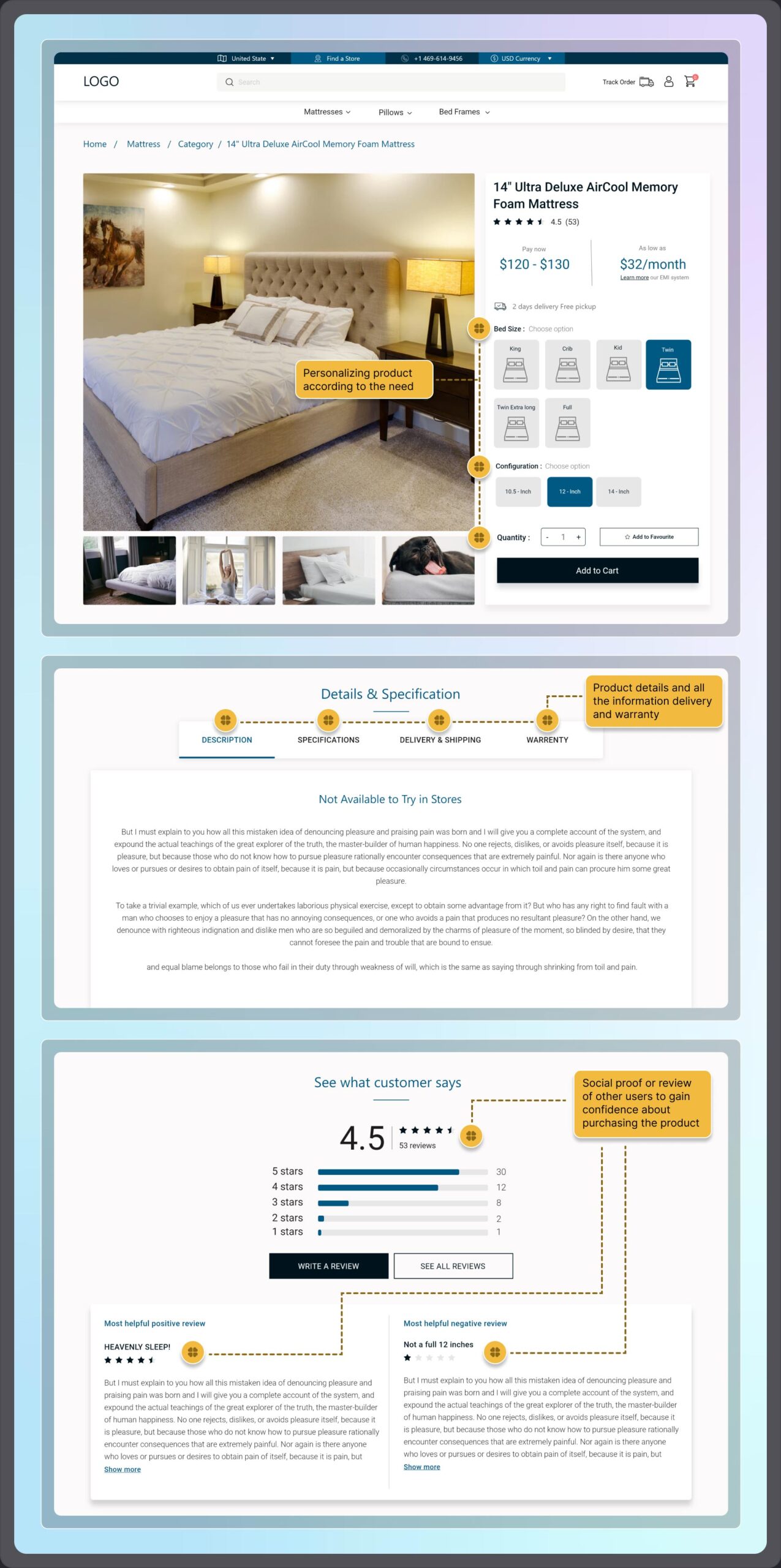
Users highly value personalized purchases that offer comprehensive product details and essential information. Furthermore, they seek assurance for their choices through reviews left by other users who have purchased the same product.
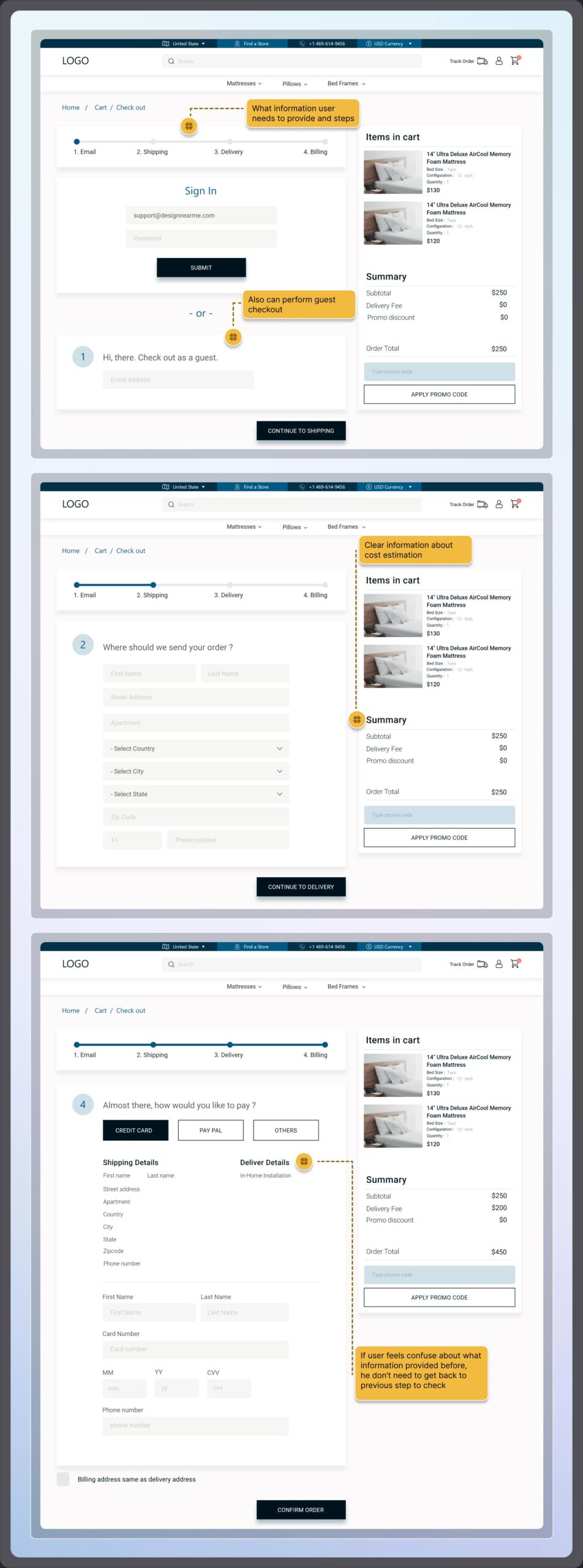
Users consistently seek clarity on the information required from them and its purpose. They appreciate a step-by-step approach to tasks. Additionally, they expect transparency with no hidden charges, the option to proceed as a guest, and upfront information to avoid the need for double-checking before making a payment.
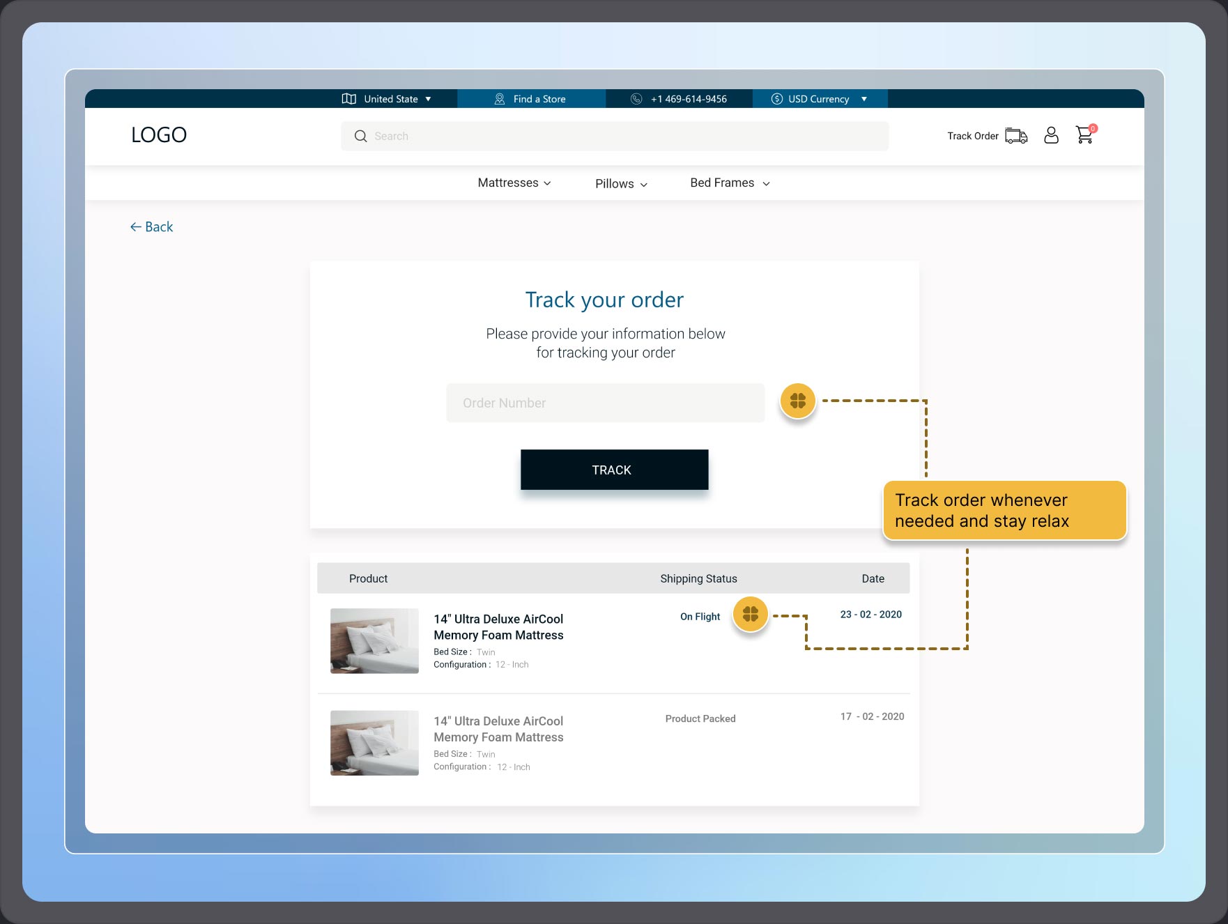
Users often experience unease when deliveries are delayed or when they lack information about the status of their product shipment. They prefer to stay well-informed about the progress of their product’s shipping.
CHALLENGE #1
Mattresses come in various sizes, materials, and firmness levels. Designing an intuitive customization process that caters to diverse customer preferences can be challenging.
CHALLENGE #2
Balancing the need to provide comprehensive product information with the risk of overwhelming users with details. Striking the right balance is crucial.
CHALLENGE #3
Building trust and conveying the comfort and quality of mattresses through a digital interface can be challenging. Users want to physically experience a mattress before purchase.
CHALLENGE #4
Managing and displaying user reviews and ratings effectively while ensuring authenticity and credibility can be a challenge.
CHALLENGE #5
Designing a seamless and secure checkout process that minimizes cart abandonment rates can be difficult. Users may have concerns about payment security.
CHALLENGE #6
If targeting an international audience, dealing with currency conversion, language barriers, and varying user expectations can be challenging.
After showcasing the final design and illustrating how the website would enhance usability and drive sales, the product owners expressed their delight. Following user testing conducted by the product owner, it was revealed that 19.7% of users found this website more user-friendly for purchasing mattresses compared to competitors.
As the project came to a close, I acquired valuable insights into e-commerce products and user preferences for each specific item sold on e-commerce platforms. I expanded my knowledge about the challenges users face when making purchases from e-commerce websites. However, due to the project’s time constraints and scope, not all of these challenges could be fully addressed in this phase. Should I have the opportunity to participate in the next phase of this project, my goal would be to tackle more user pain points and further enhance the overall e-commerce experience on this website.
